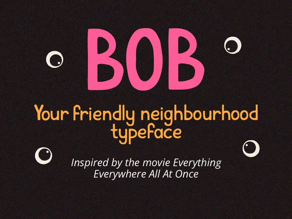
Bob the typeface
Overview
Goal
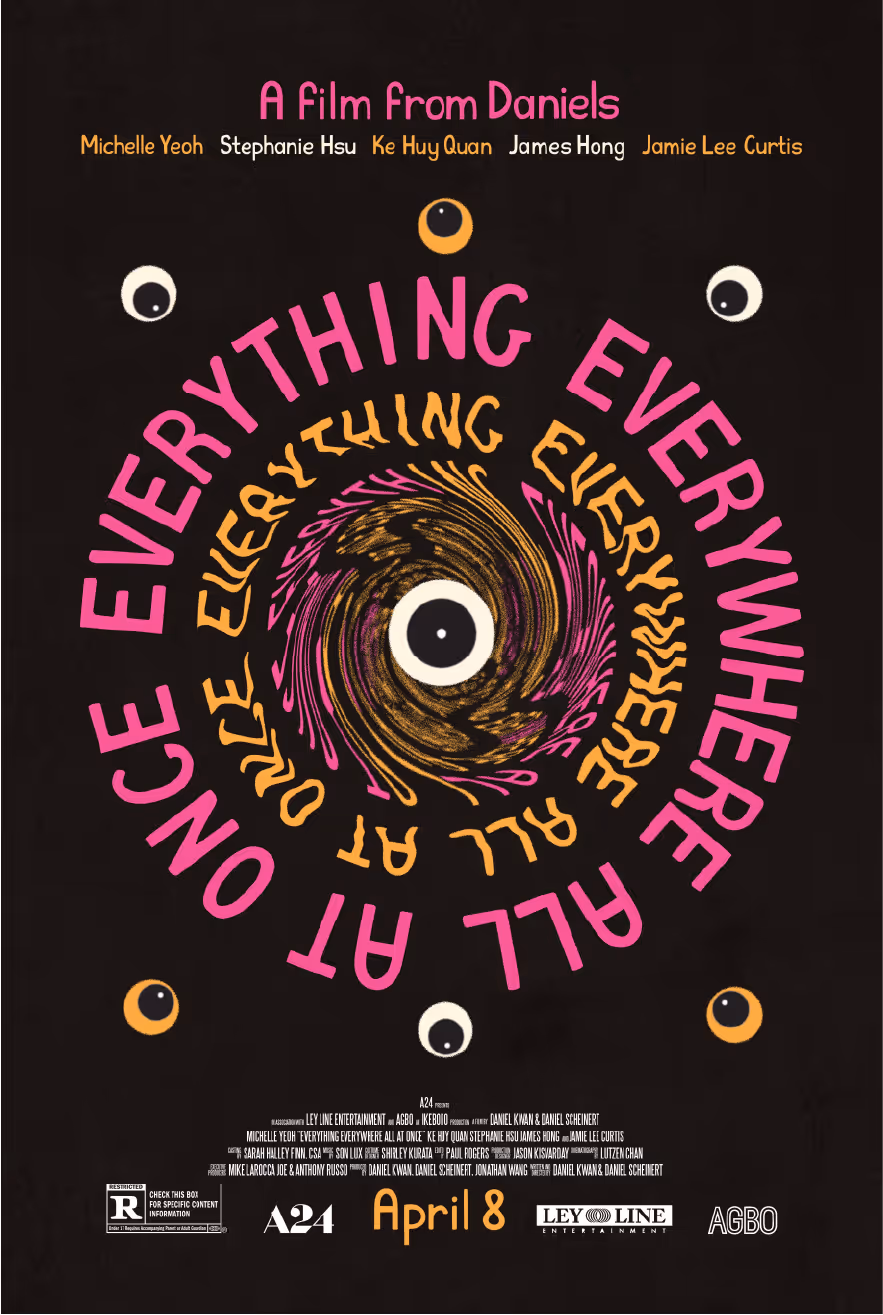
Create a custom typeface that would suit a selected movie's (Everything Everywhere All at Once) vibe, mood, and target audience, building a design system including a movie poster and merchandise.
Challenge
Creating a handwritten typeface that didn't feel outdated and 2000-esque,
Balancing character and legibility; maintaining consistency across all letters and symbols,
Making the typeface the main character of the merch and the poster.
Strategy
Expressive, bold typography, featuring some sort of handwritten, rough feel to highlight the raw emotional aspect and featuring a nod to Chinese brush lettering.
Chaotic, untraditional composition of the poster, featuring a dynamic layout, vibrant bold colors, wide color palette, and featuring a sense of movement to highlight the multiverse aspect.
Target Audience
Indie film lovers and fans of A24 in particular
Millenials and GenZ of all genders
People who enjoy fast-paced, unconventional storytelling
Immigrants and children of immigrants
People who are drawn to weird, undefinable, fantasy/sci-fi movies
People with a sense of humor
Process
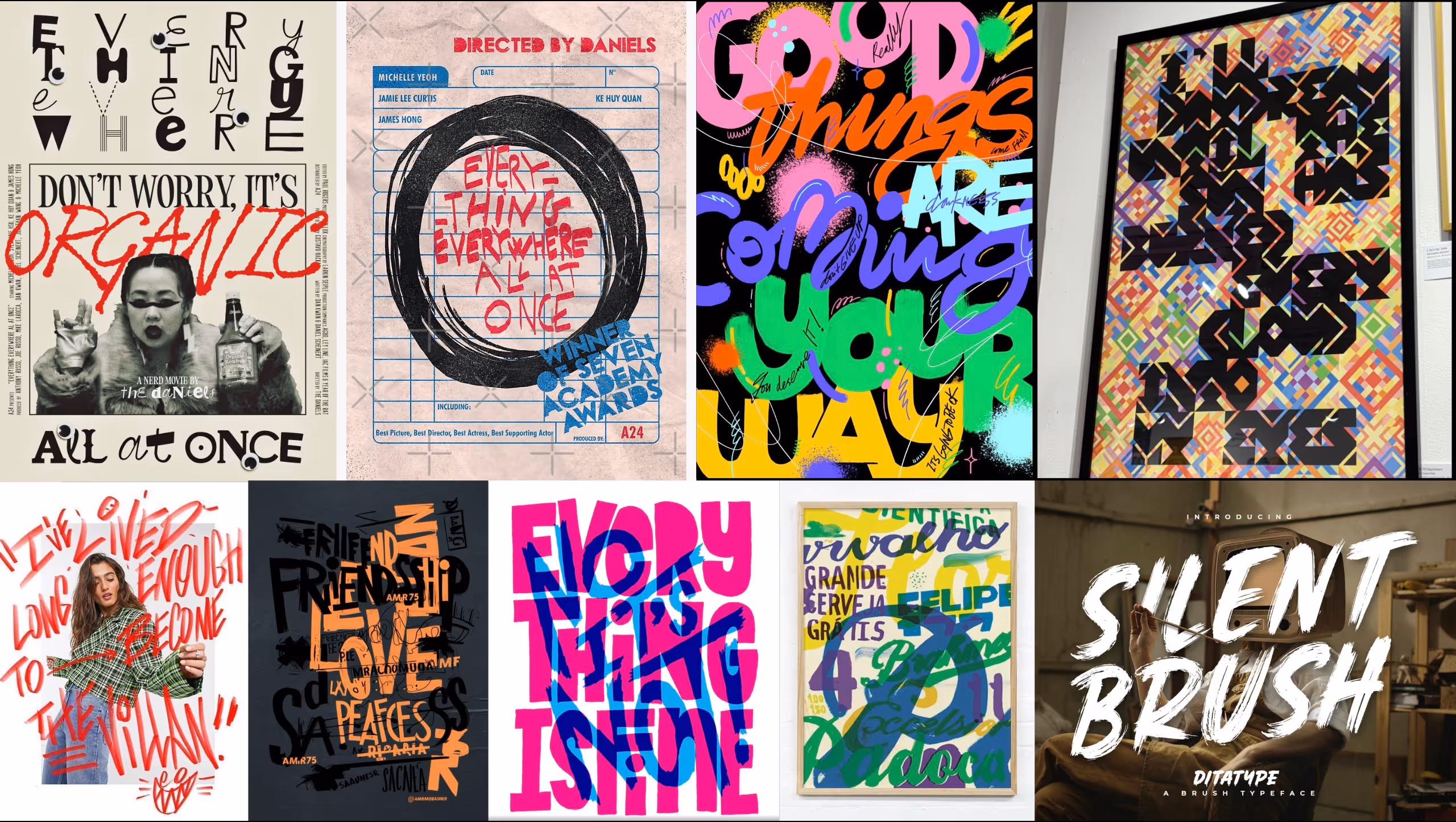
Moodboard
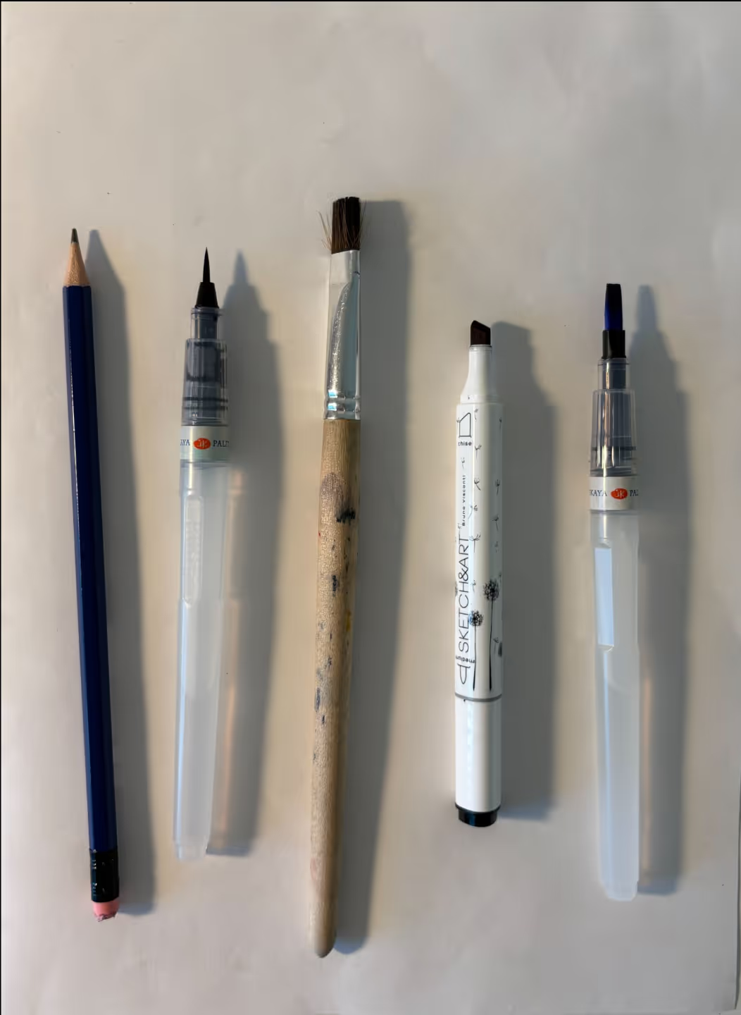
Choice of Medium
The hardest part of the sketching process was figuring out the medium I wanted to use, down to the specific brush I was using. On the right are options I explored:
- Pencil
- Small calligraphy brush
- Flat rough brush
- Marker with a blunt tip
- Flat sleek brush
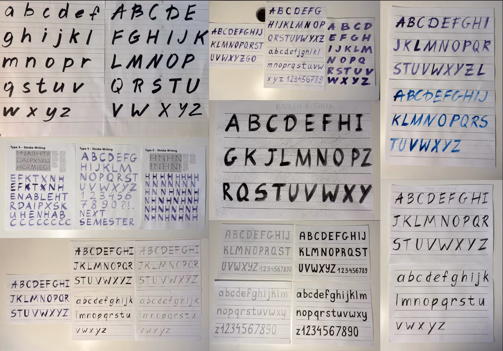
Sketches
The process involved a lot of trial and error, working with mediums that I hadn't picked up in a while, remembering how to paint with watercolors, controlling stroke widths and my handwriting.

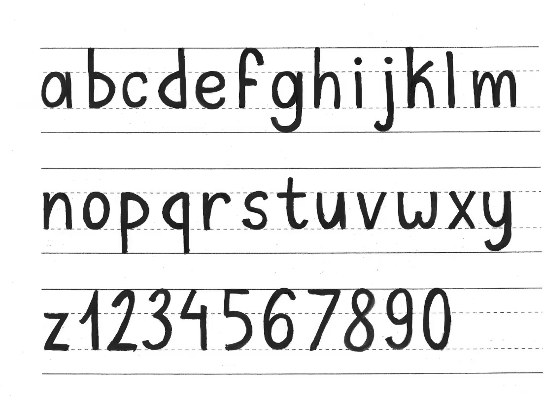
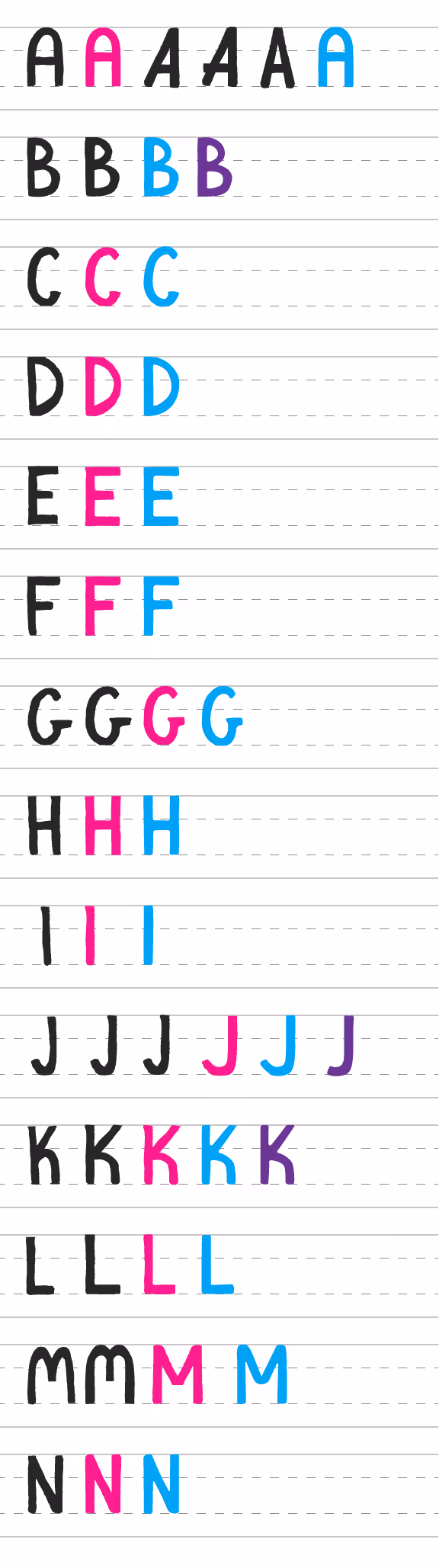
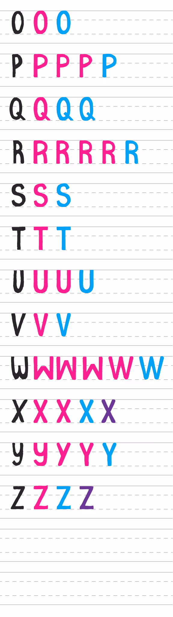
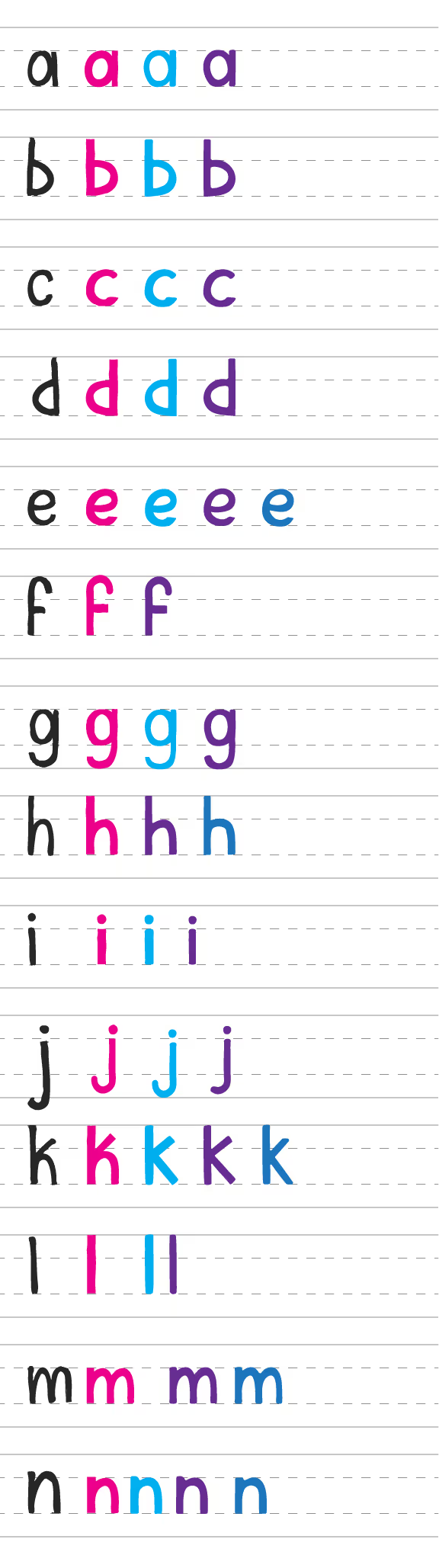
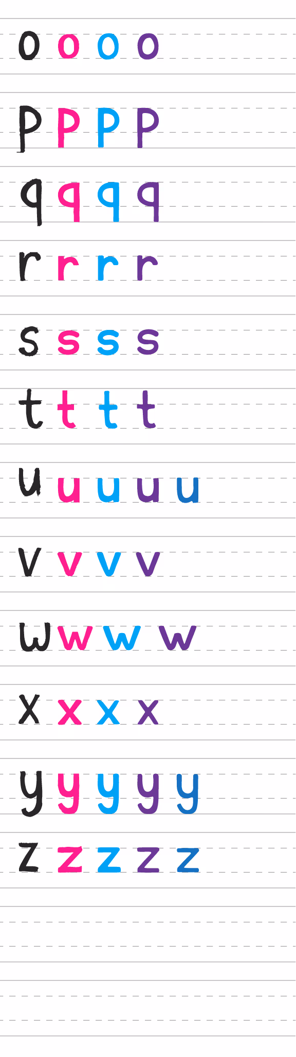
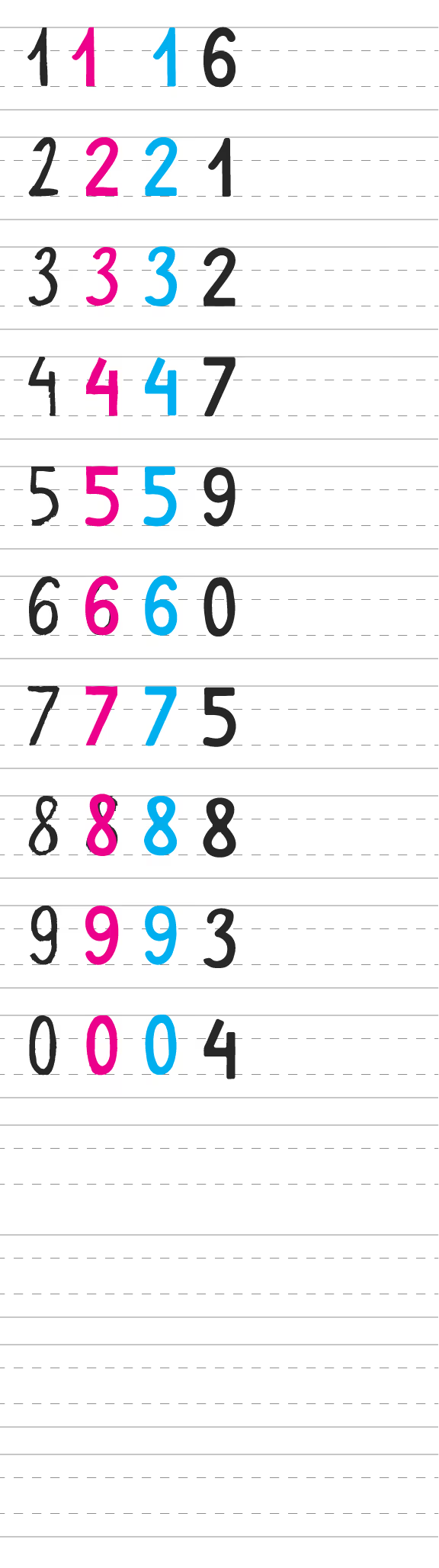
Digital Typeface Process
The typeface process included image tracing the sketches to preserve the texture and manually fixing each letter to ensure consistent shapes, strokes and imperfections.
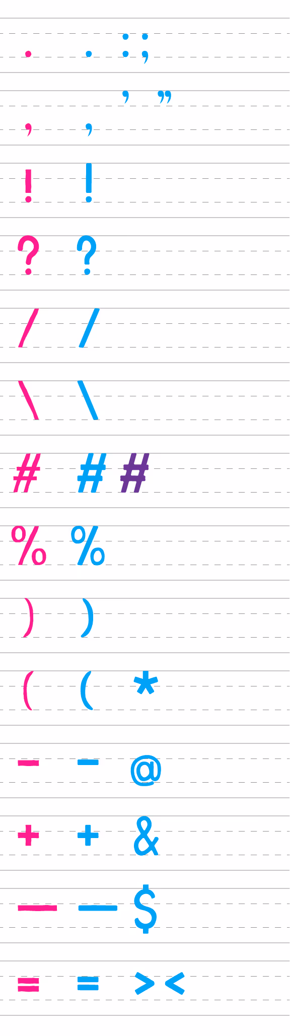
Introducing...


Poster Process
The poster process involved a lot of playing with colors, layouts and compositions.
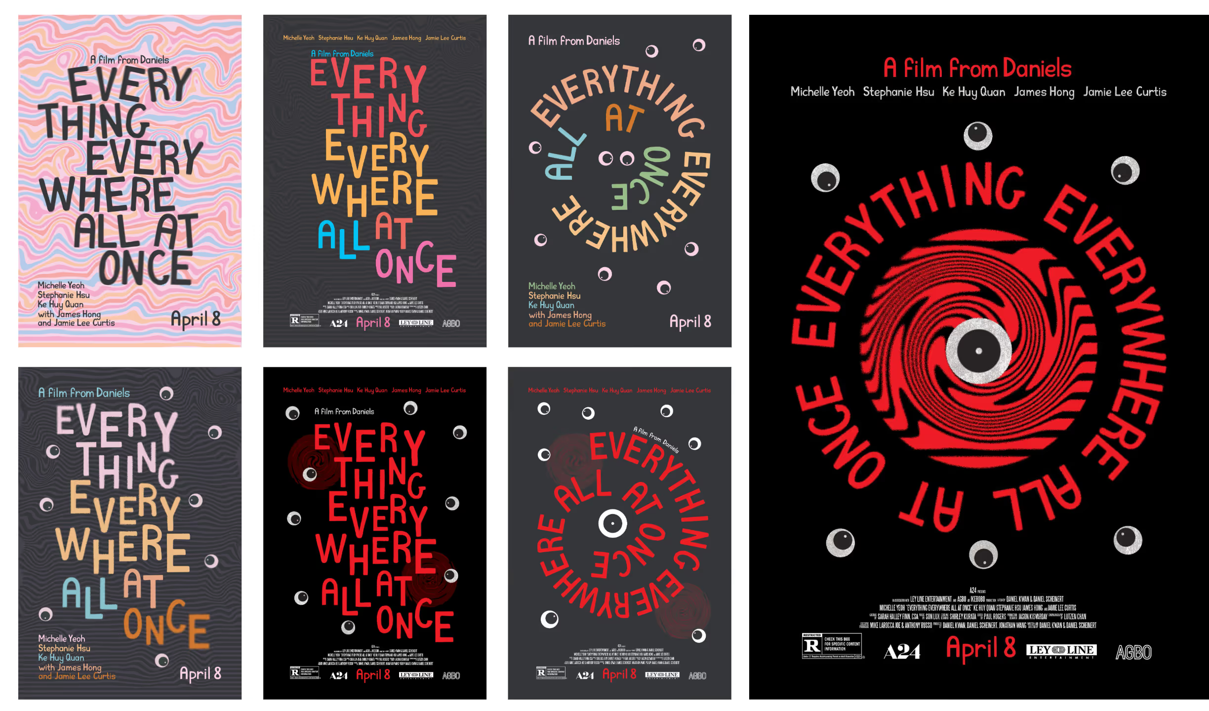
Final Poster
Featuring a friendly but bold colour palette, weird and unsettling elements, dynamic composition conveying the sense of movement, and making the typeface shine as the main character.
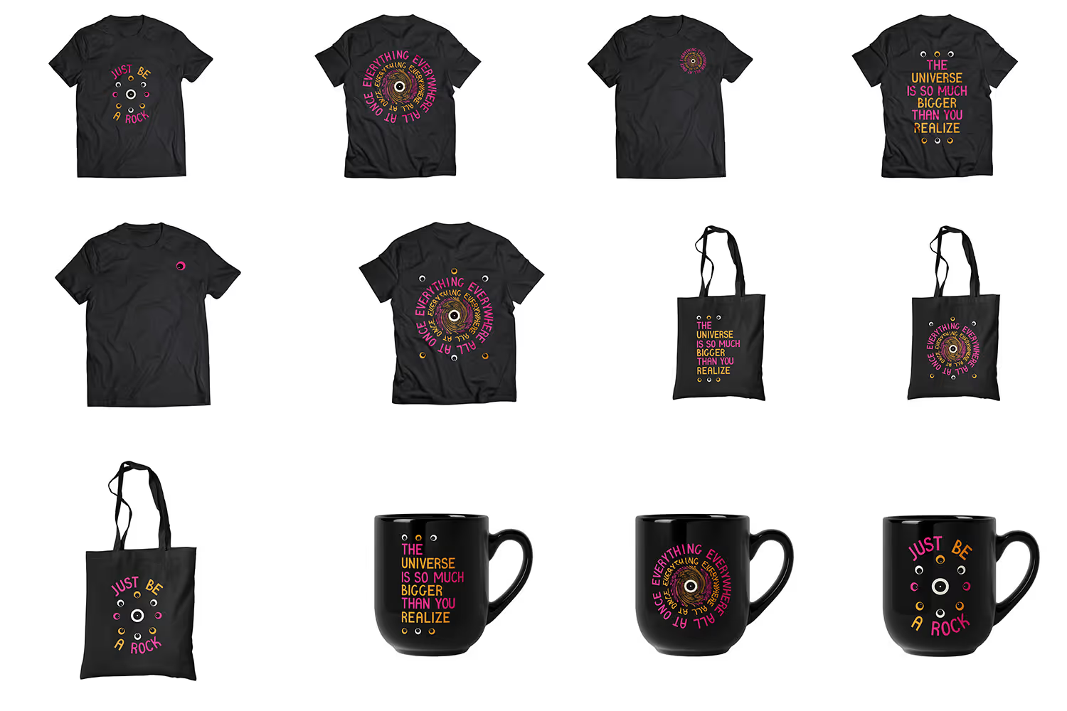
Merch Design
Design of three t-shirts (front and back), three tote bags and three mugs, using the poster's branding and quotes from the movie.