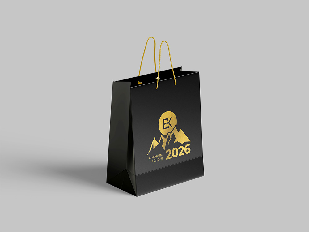
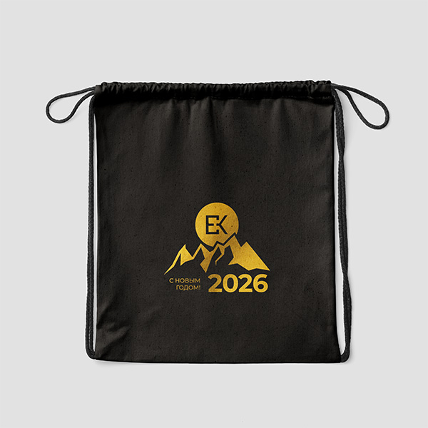
Development of a logo, brand assets, website and client corratelal for ESC – a subsidiary of Sibgeoconsulting LLC, which I have worked for more than two years.
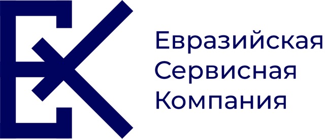
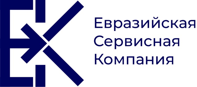



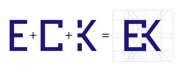
The final result was this perfectly geometrical design – a combination of letters E, C and K comprising the name of the company.
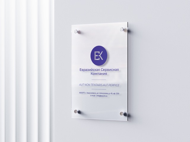
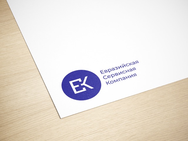
After a talk with the client, the lettermark was approved with one modification: adding a circle around the lettermark. This is the final logo for the company.
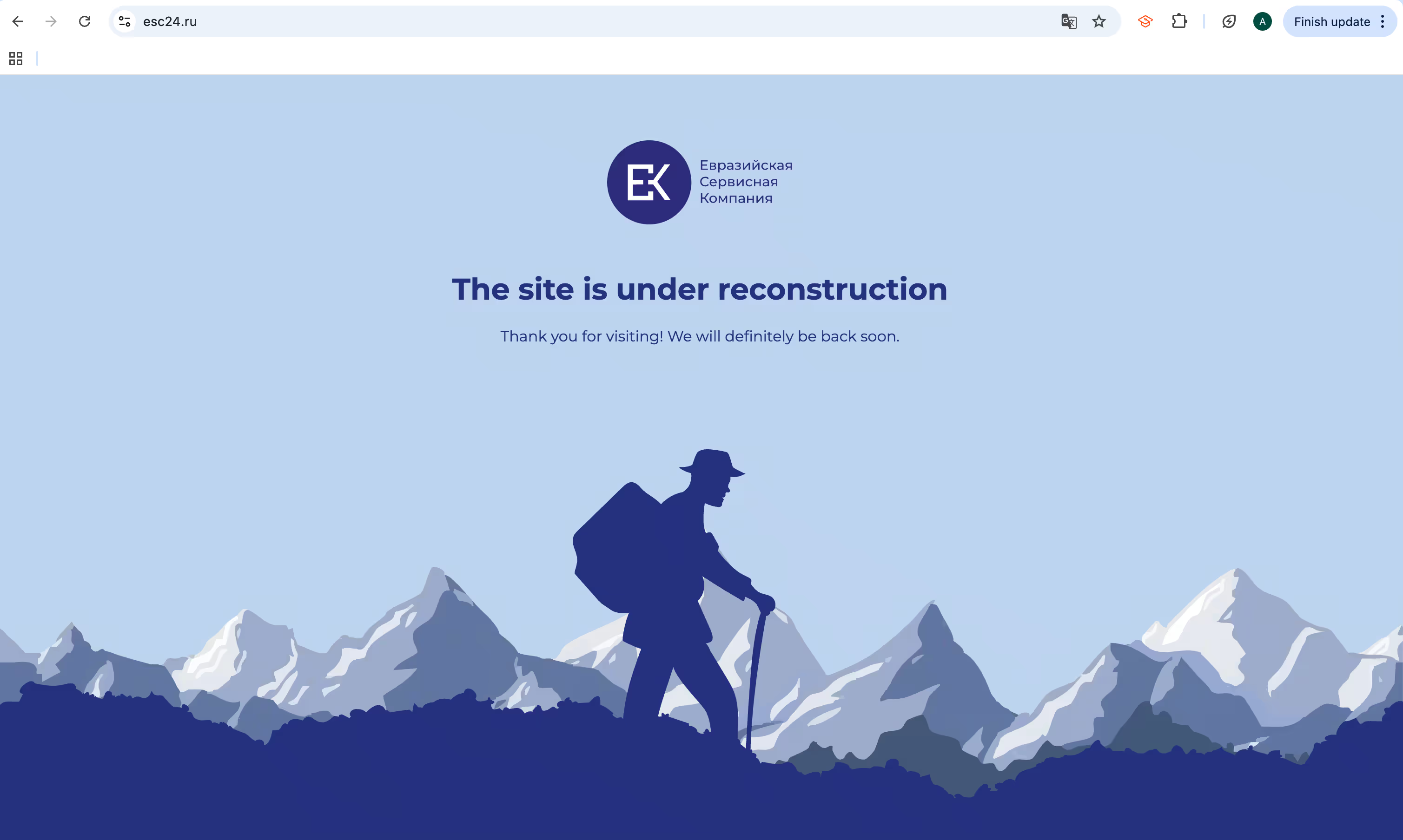
An under-construction page of the website with a geology-related graphic in brand colors.
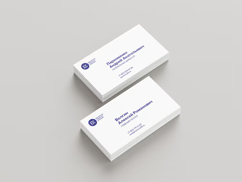
Minimalistic business cards.
Gift bag design for client gifts.
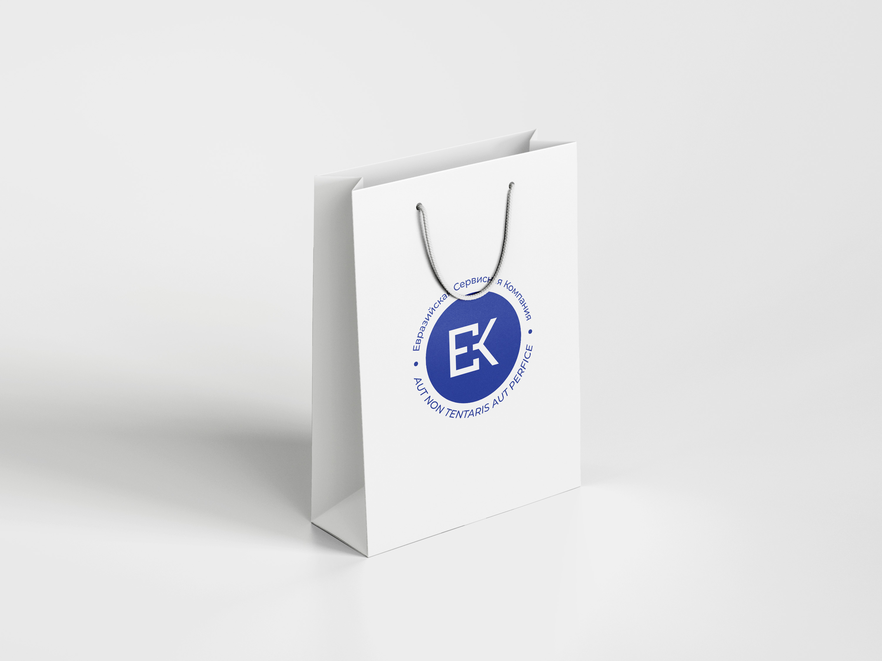
We explored different options for this year: a paper gift bag, a drawstring bag, and a backpack. Initially, the design was planned in the company's blue and white colors, but after consideration, we made the decision to explore the premium black and gold combination, fitting for the geological industry.

