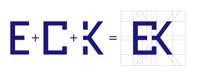
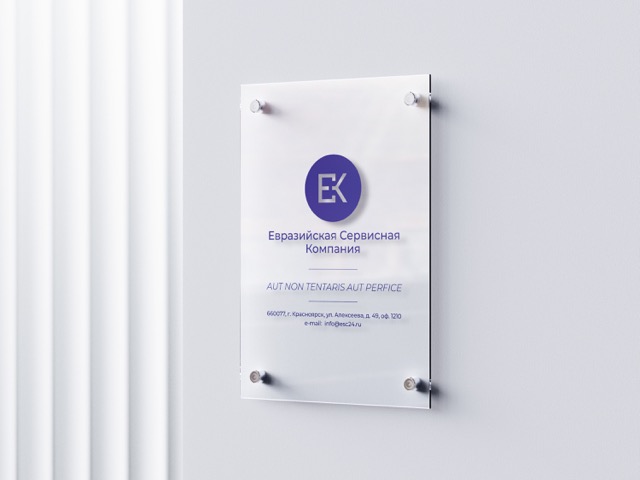
As part of my long-standing collaboration with SGC (СГК), a geological company based in Krasnoyarsk, Russia, I developed a logo for their subsidiary company ESC (ЕСК).
The client wanted a straightforward yet interesting lettermark logo. They wanted to emphasize the global nature of the company and it's direction into the future.
After the initial talk with the client, I set to work and developed many options for the logo.

