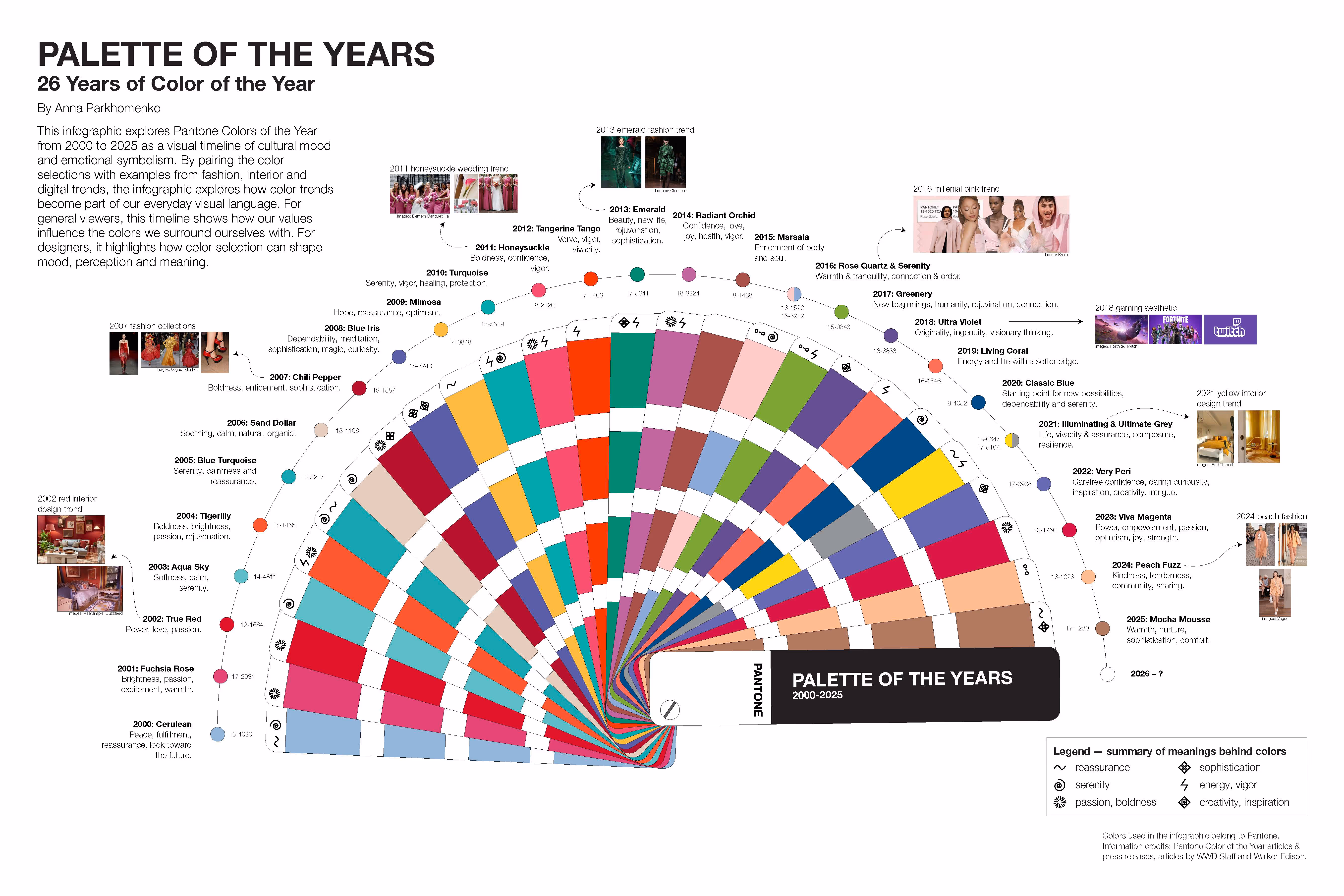
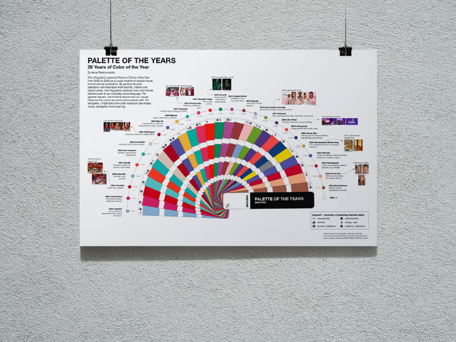
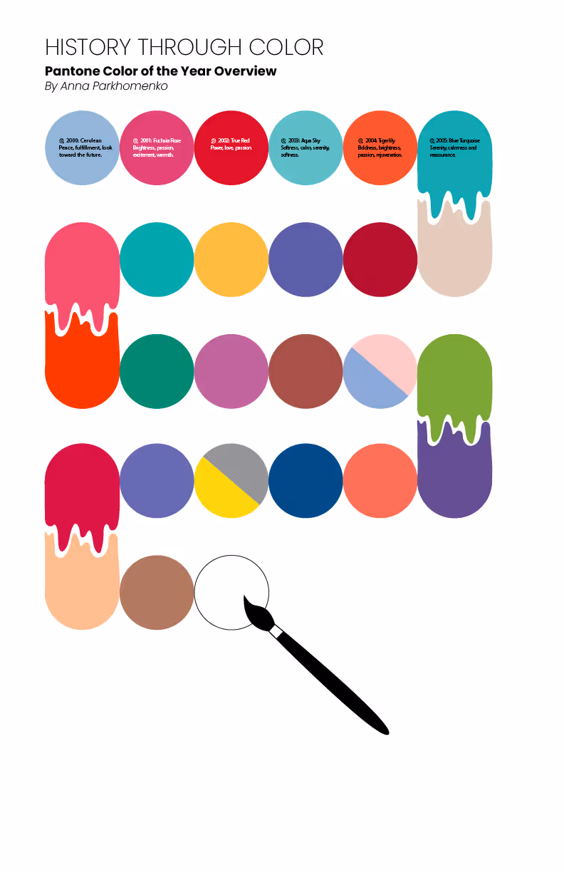
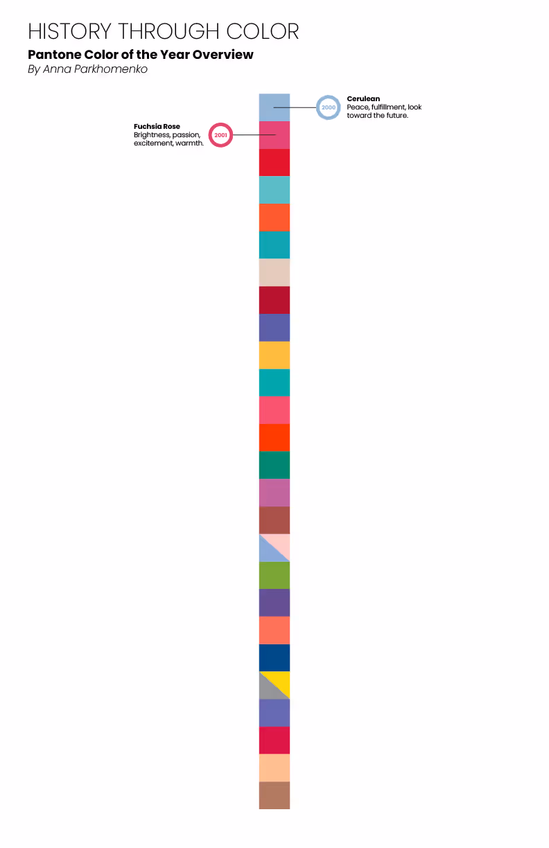
Palette of the years
Overview
Goal
Explore Pantone Colors of the Year from 2000 to 2025 as a visual timeline of cultural mood and emotional symbolism.
Challenge
Present information in a clear structured way.
Present a viewpoint of how the Color of the Year are applicable and important to designers.
Strategy
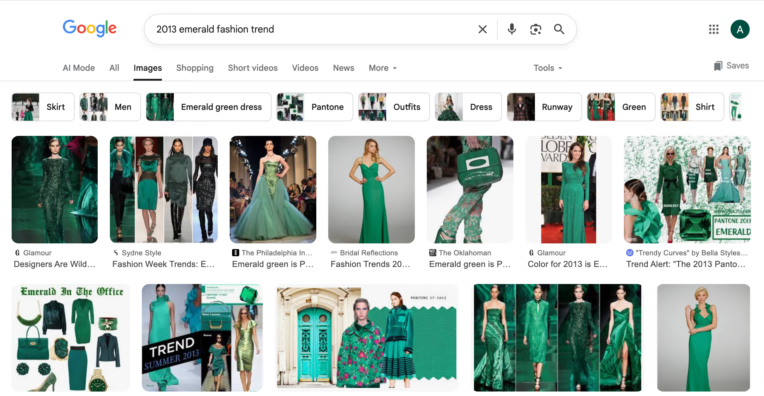
By pairing the color selections with examples from fashion, interior and digital trends, the infographic explores how color trends become part of our everyday visual language.
Target Audience
For general viewers, this timeline shows how our values influence the colors we surround ourselves with. For designers, it highlights how color selection can shape mood, perception and meaning.
Process
Moodboard
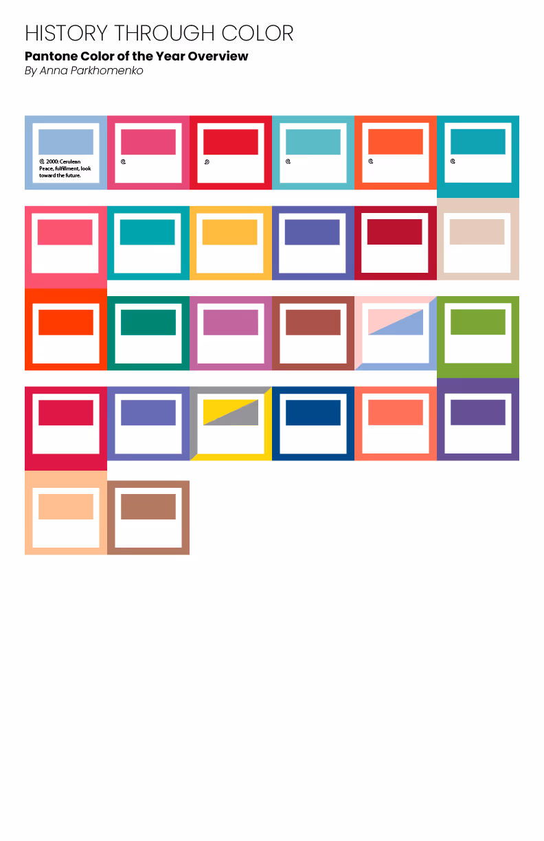
Rough Layouts
Data
The process of compiling the data included two phases:
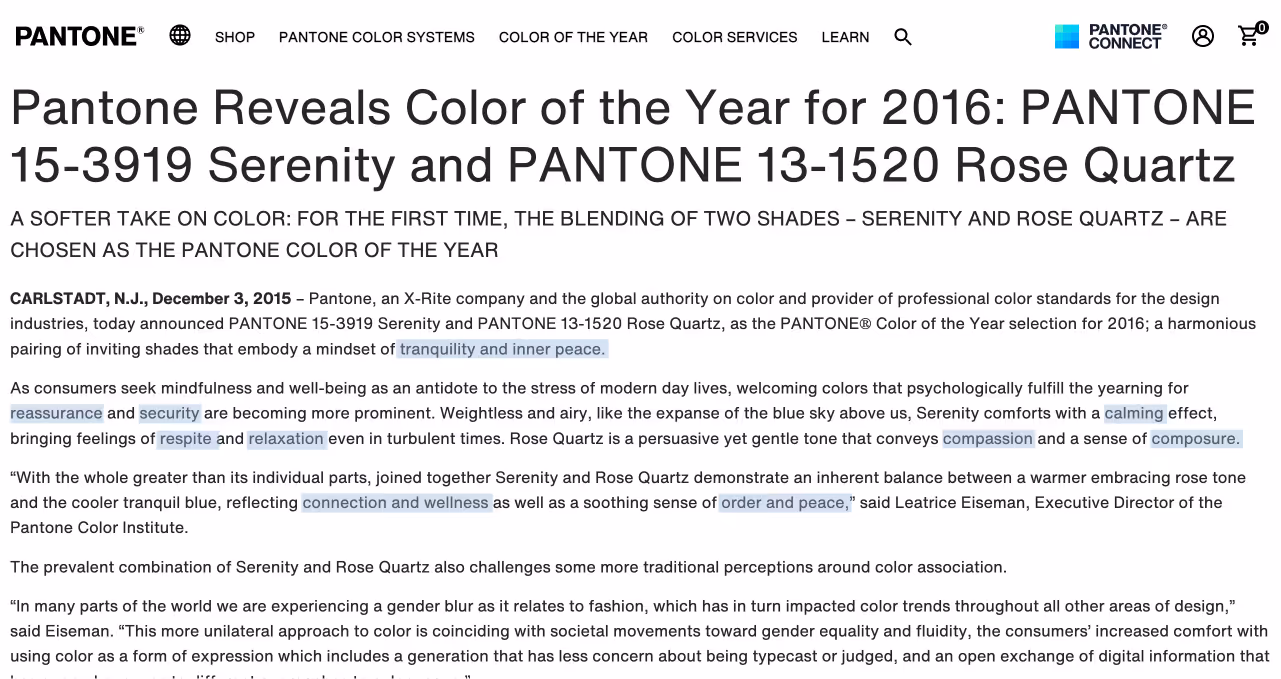
- Going through Pantone official articles and press releases on Colors of the Year, conducting keyword analysis on the articles and narrowing down the color meanings to one of six categories (reassurance, serenity, passion, sophistication, energy, creativity).

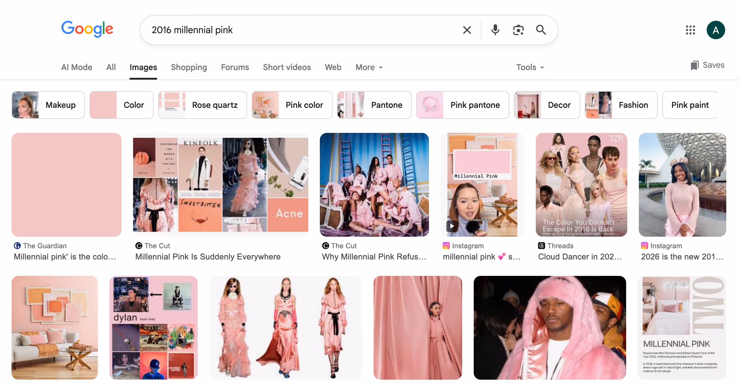
- Searching for particular trends in fashion, entertainment, interior design and graphic design for each year and narrowing down on particularly illustrative examples.
Result
Created an infographic with a fun unexpected layout that clearly calls back to the subject matter while keeping the information readable and accessible.