Selene Branding & Packaging
Overview
Goal
Create a brand of de-alcoholized wine & cheese that stood out amongst it's competitors and delivered a premium experience, leveraging strict hierarchy in the layout and sunset-themed public domain artworks
Challenge
Creating a non-alcoholic wine packaging that would still be proudly displayed in a restaurant without looking childish or cheap
Strategy
Narrowing down on what drinking wine feels like and building a brand concept centering around sunset and evening imagery and colors.
Creating packaging that looks elegant and expressive by working with art, ornaments, tight hierarchy, white space and serif typography.
Ensuring a premium user experience with the packaging, coming up with shapes for the boxes that felt unique and easy to use.
Connecting the packaging concepts of the wine and the cheese tightly to ensure they worked well in tandem.
Target Audience
People in their 20-30s
People into art
People who don’t or can’t drink alcohol but like the taste or don’t want to be left out
Middle to high income
Sophicticated and meticulous in their choices
Restaurant-goers and foodies
Process
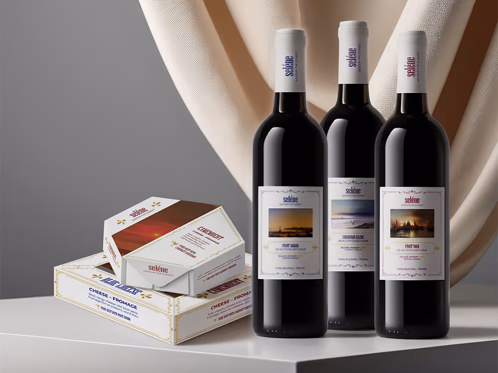
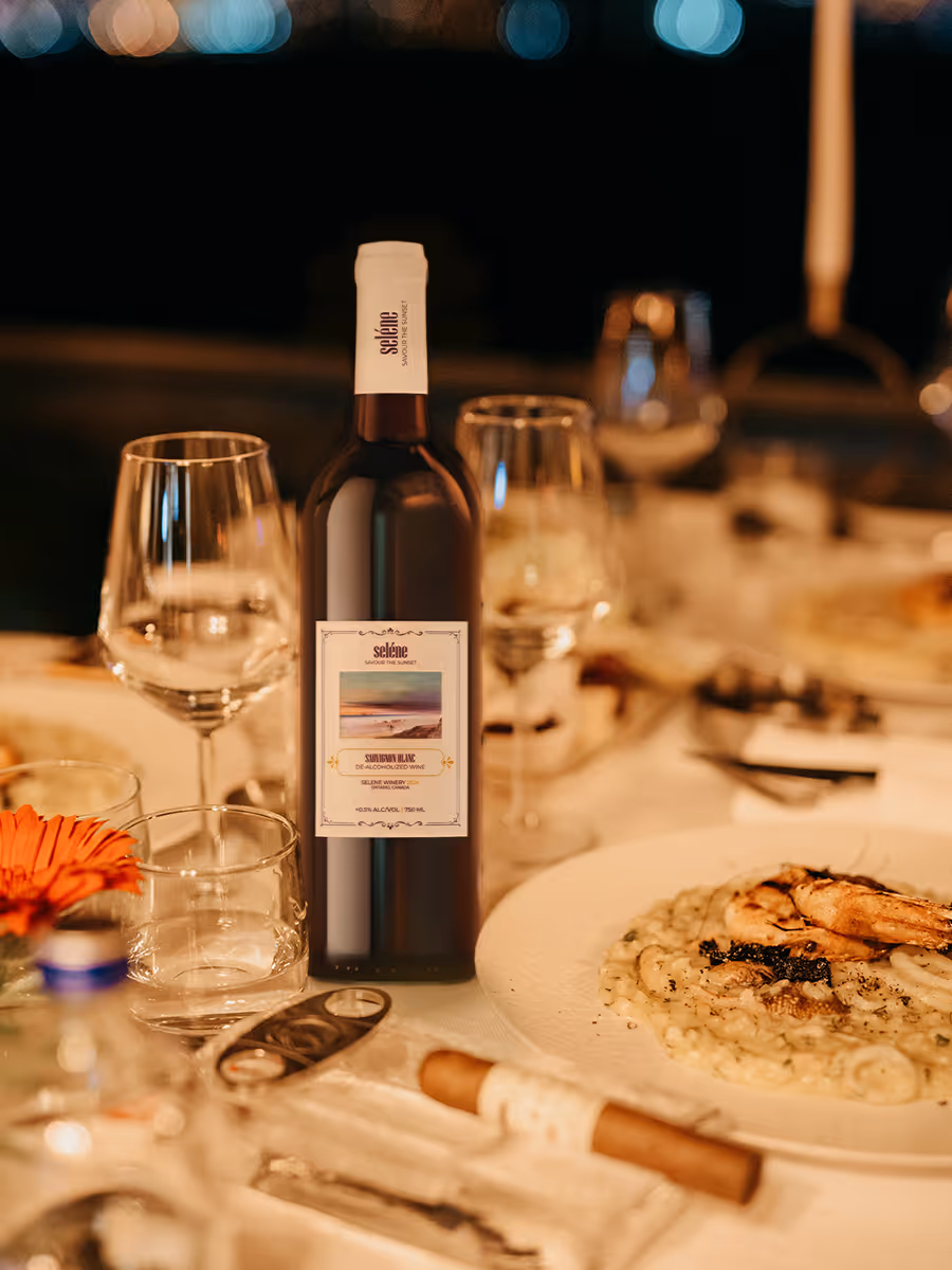
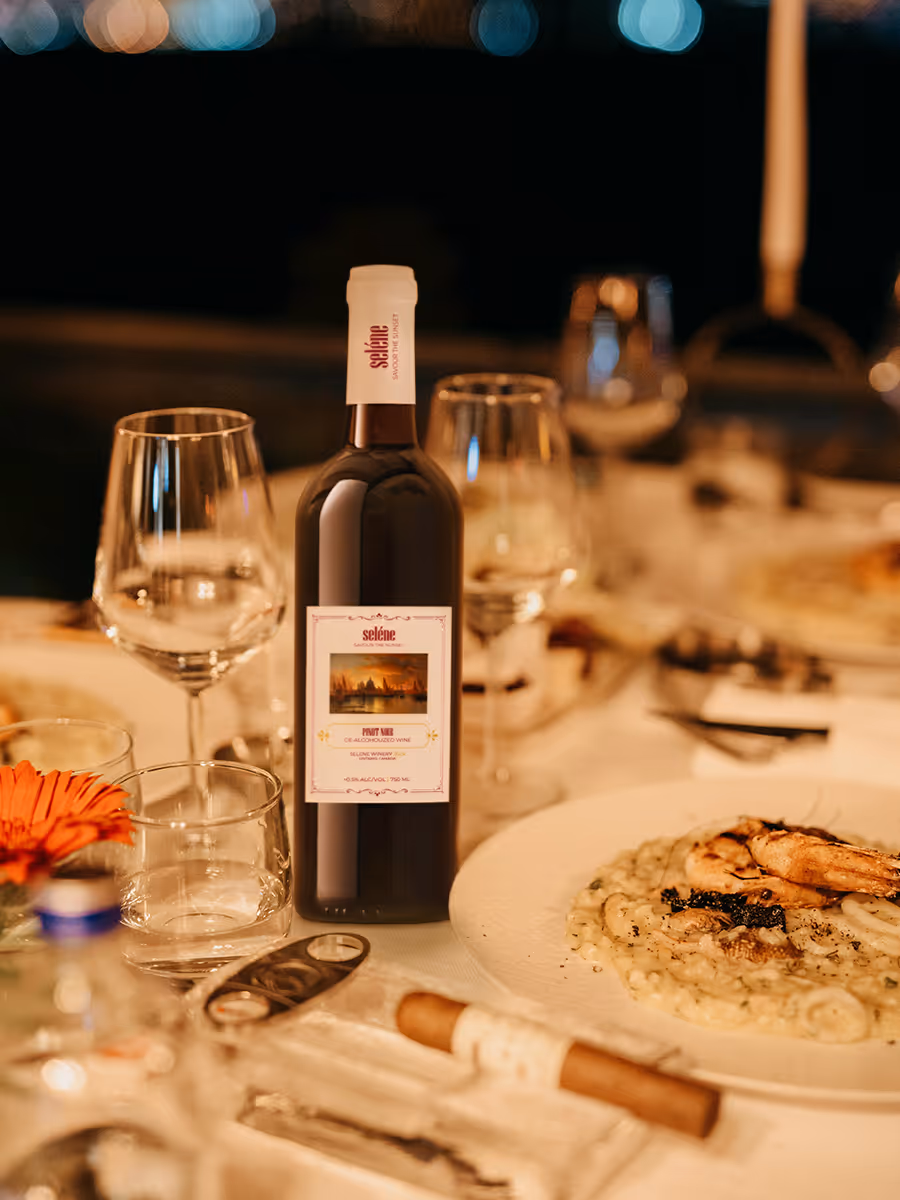
Wine Labels
The idea behind the visual identity is that a product shouldn't only offer a physical experience (taste, in this case), but also create a vibe, an atmosphere around itself. For Selene, I made a decision that each bottle should feel like a piece of art that you would proudly display on a shelf, whether at a restaurant or at home. The whole theme of the brand centered around evening relaxation, and, keeping with the elegant, upscale positioning, I designed the labels using public domain sunset paintings, clear visual hierarchy, elegant typography and intricate ornaments.

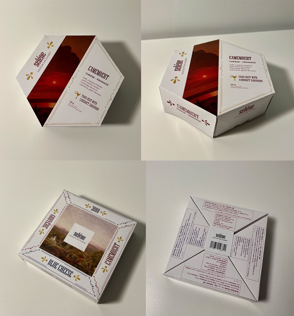
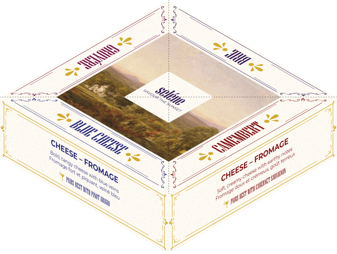
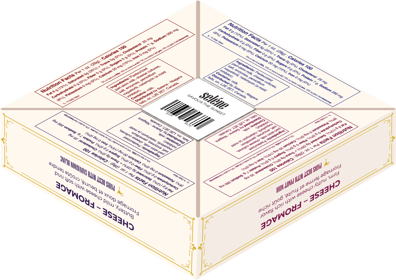
Cheese Packaging
The brand grows and now offers a complimentary product: cheeses paired with wines. The packaging had to follow the established design system, but offer something else, something new. That "something new" came as an experimentation with form. I designed packaging that was unique and memorable. To keep the consistency and brand connection, each cheese has a set wine pairing from Selene's offerings. And to make it more apparent, each cheese uses the same designated color as its pairing, along with featuring a recommendation on the package.
The first package is a tasting set of four cheeses. It prints and assembles as a single piece, but each cheese can be pulled apart from the box individually.
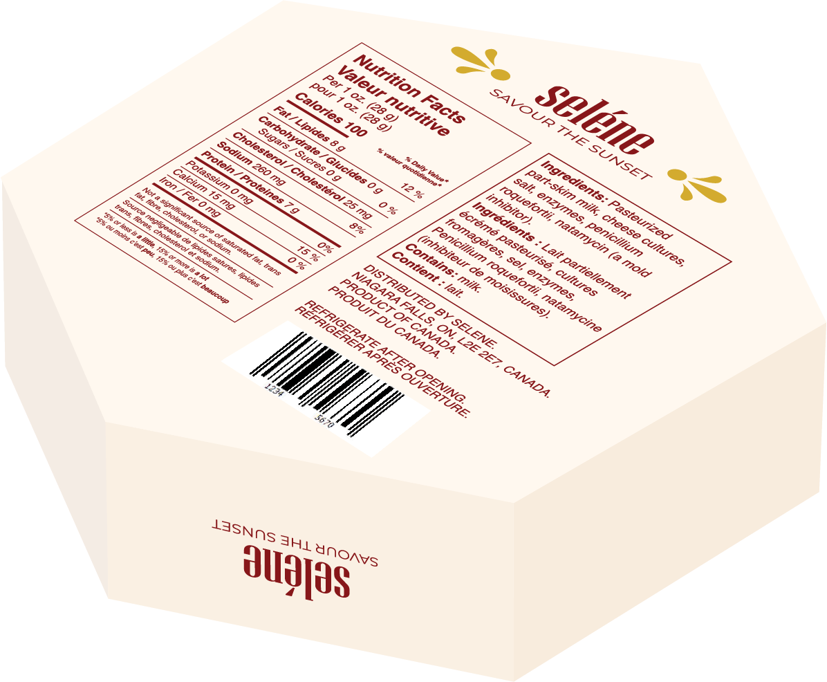
The second package is an individual box for a wheel of cheese, camembert, in this case. The octagonal form is both unique and practical: it stands out from typical square or circle offerings, but is easy to print, assemle, and stack on a shelf.

Result
- Created a brand of wine that would appeal to a sophisticated audience without the alcohol content.
- Delivered a set of products for a premium experience of an evening of relaxation.