gutenberg project website redesign
Overview
Goal
Promoting reading by improving the user experience of The Gutenberg Project website and improving user retention
Challenge
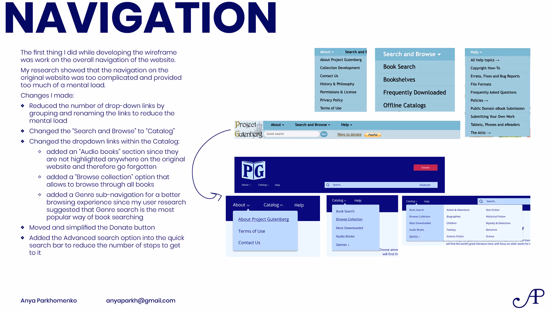
Streamlining navigation and information architecture of the website
Strategy
Formulating a concrete critical task, analyzing the website user experience to determine the core issue making the task difficult to achieve, developing a solution to the discovered issue.
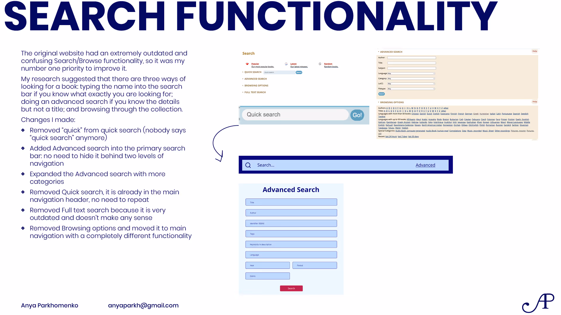
The core issues of the website, based on user testing and competitor research, were the lacking search functionality and the lack of follow-through and interconnection between books.
Target Audience
Book lovers, reading for personal enjoyment
Younger audience, 18-30 years old
Engaged with digital content, high tech literacy
Wanting to access free books due to budget constraints
The Gutenberg Project Website Redesign
Process
Empathy Map
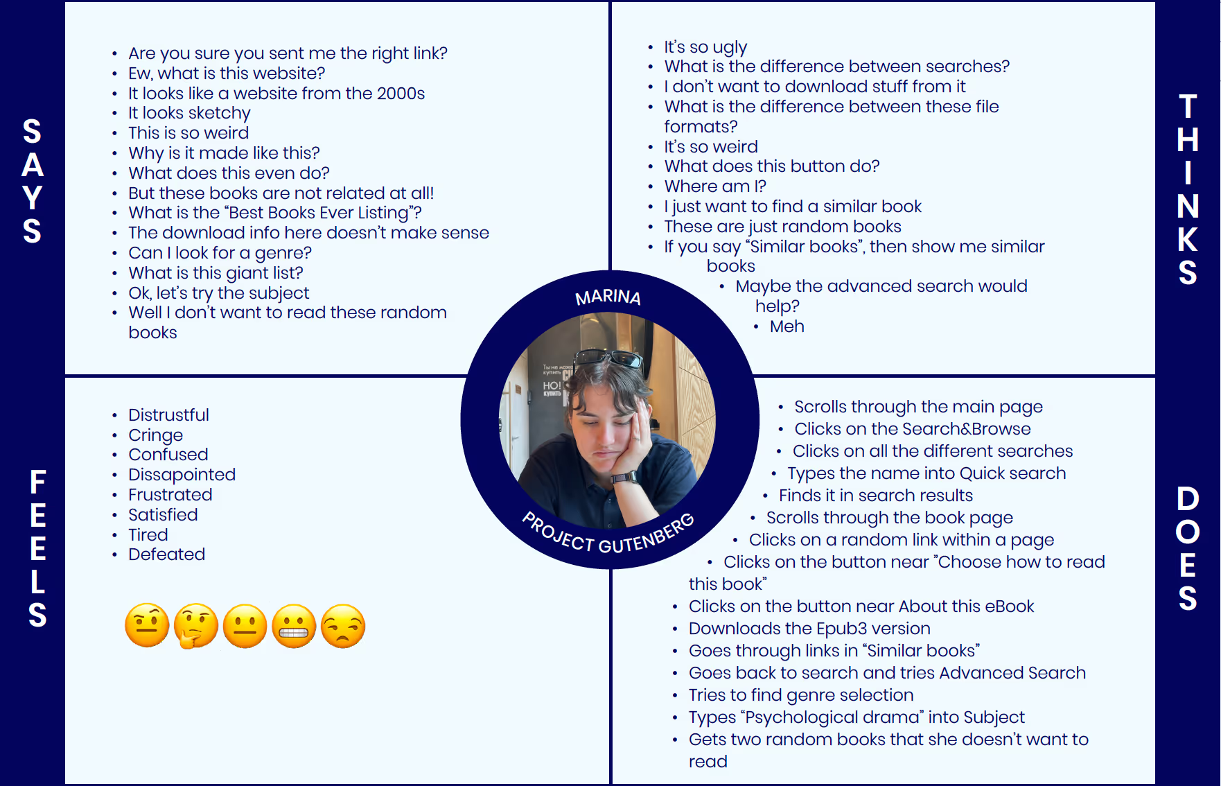
POV Statement
A lover of reading e-books needs a way to find an interesting and free e-book because books are expensive and it’s hard to find one that would cater to your tastes.
User Personas Analysis


Competitor Analysis


Summary of Discovered Issues
Collected Insights
- Standard Ebooks is the strongest competitor to Project Gutenberg; it follows the same goal of providing free public domain ebooks, and delivers a clean modern layout, good search functionality, recommendations, and very high-quality of the books themselves. Standard Ebooks gives a lot of insights into improving Project Gutenberg: in ways of layout and navigation, improving the search and the book page and adding recommendations.
- Goodreads gives the idea of establishing a rating and reviewing system within the website: it would have to be simplified, yet it is a good direction for community engagement.
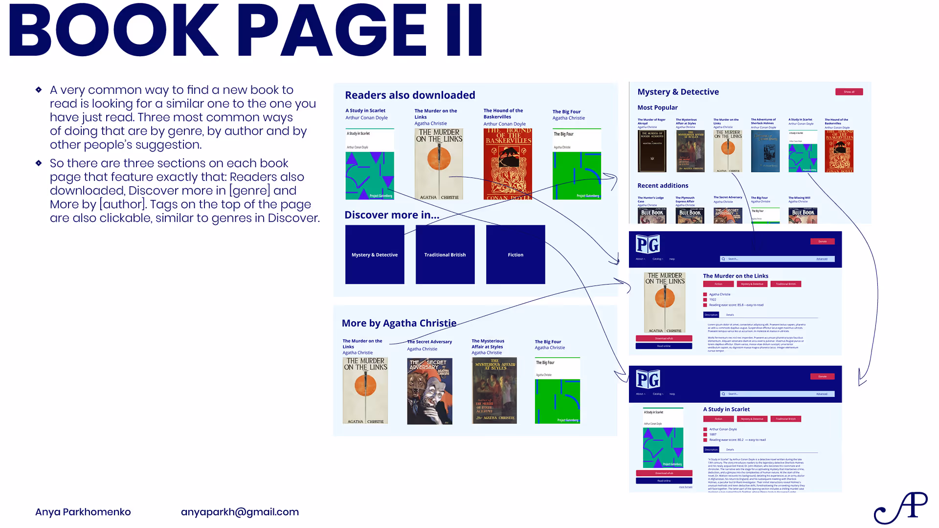
- It also provides insight into the book recommendations system: users of the website can recommend books similar to the chosen one.
- Feedbooks has the best book search functionality out of 5 competitors. It is not overwhelming but very thorough, suitable both for reading and research purposes.
- Manybooks is pretty much a negative example: while the layout is more modern and engaging, it is cluttered and overwhelming and it doesn’t solve the user’s needs.
- HathiTrust’s featured titles and collections are great for discovering new books.
Considerations for Redesign
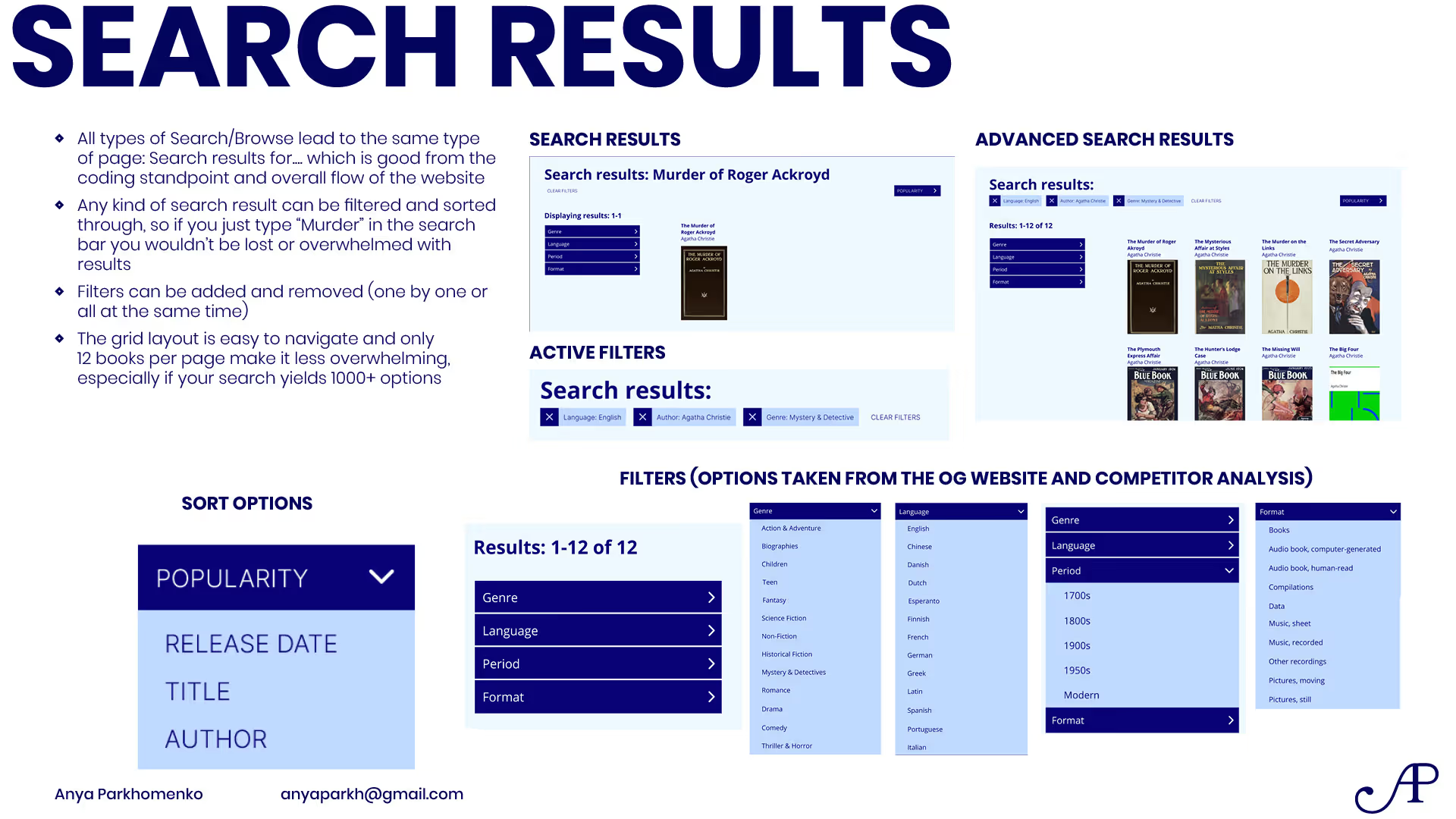
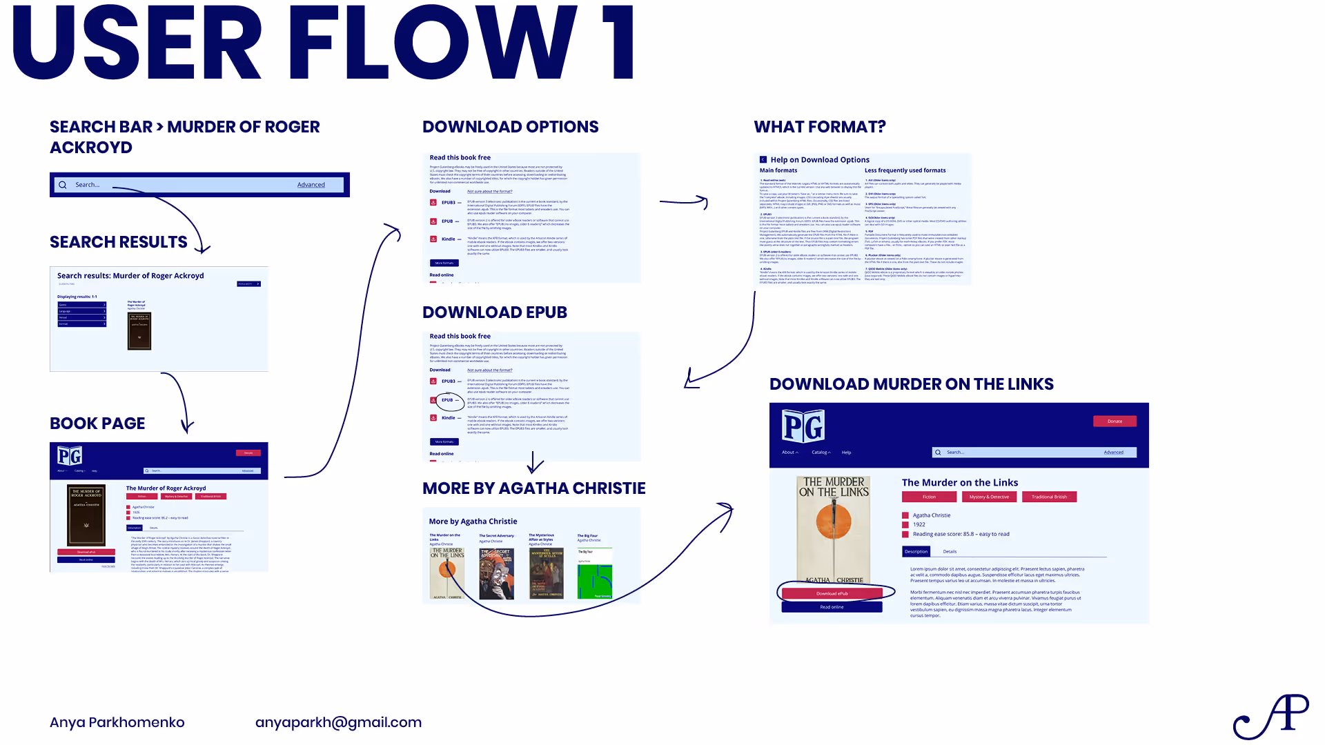
- The most important is the search functionality:
- Thorough, but not overwhelming
- Search by genre
- Search by publication date, author, publisher, etc
- Include both search and filtering the results
- Quick and advanced searches
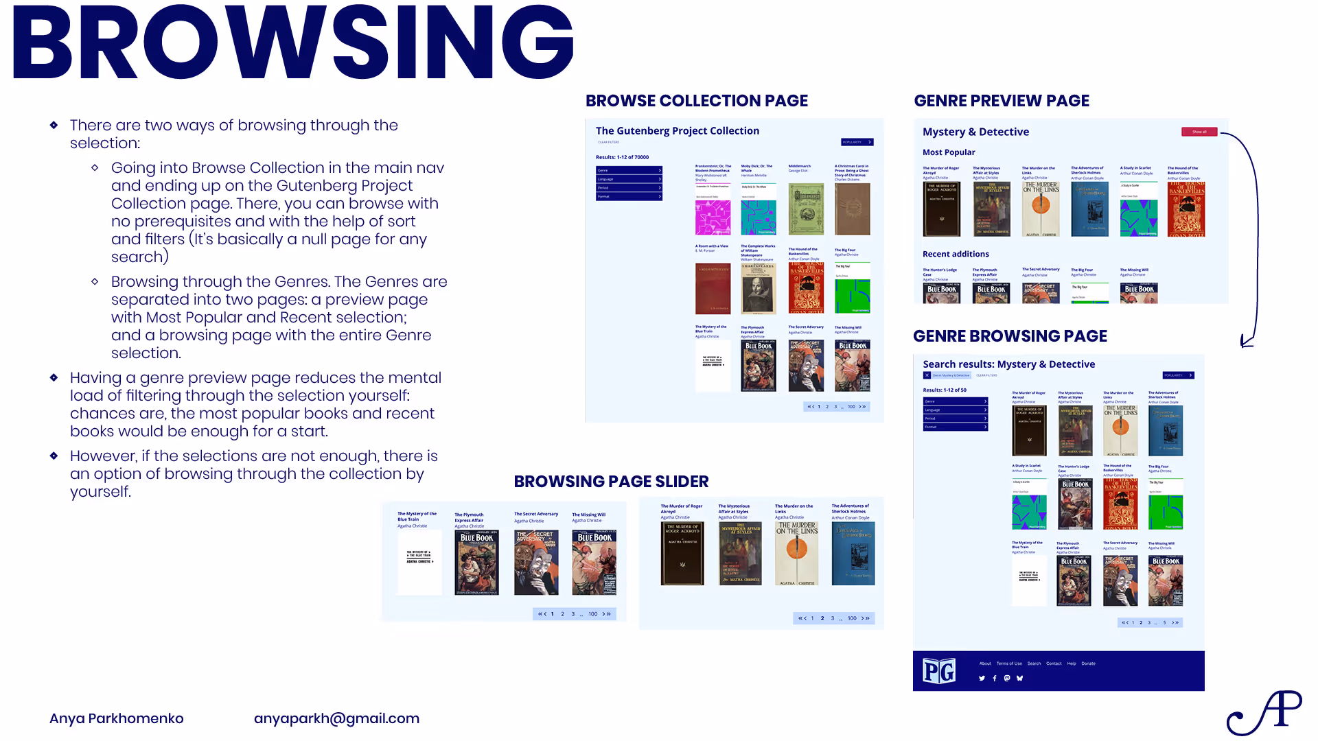
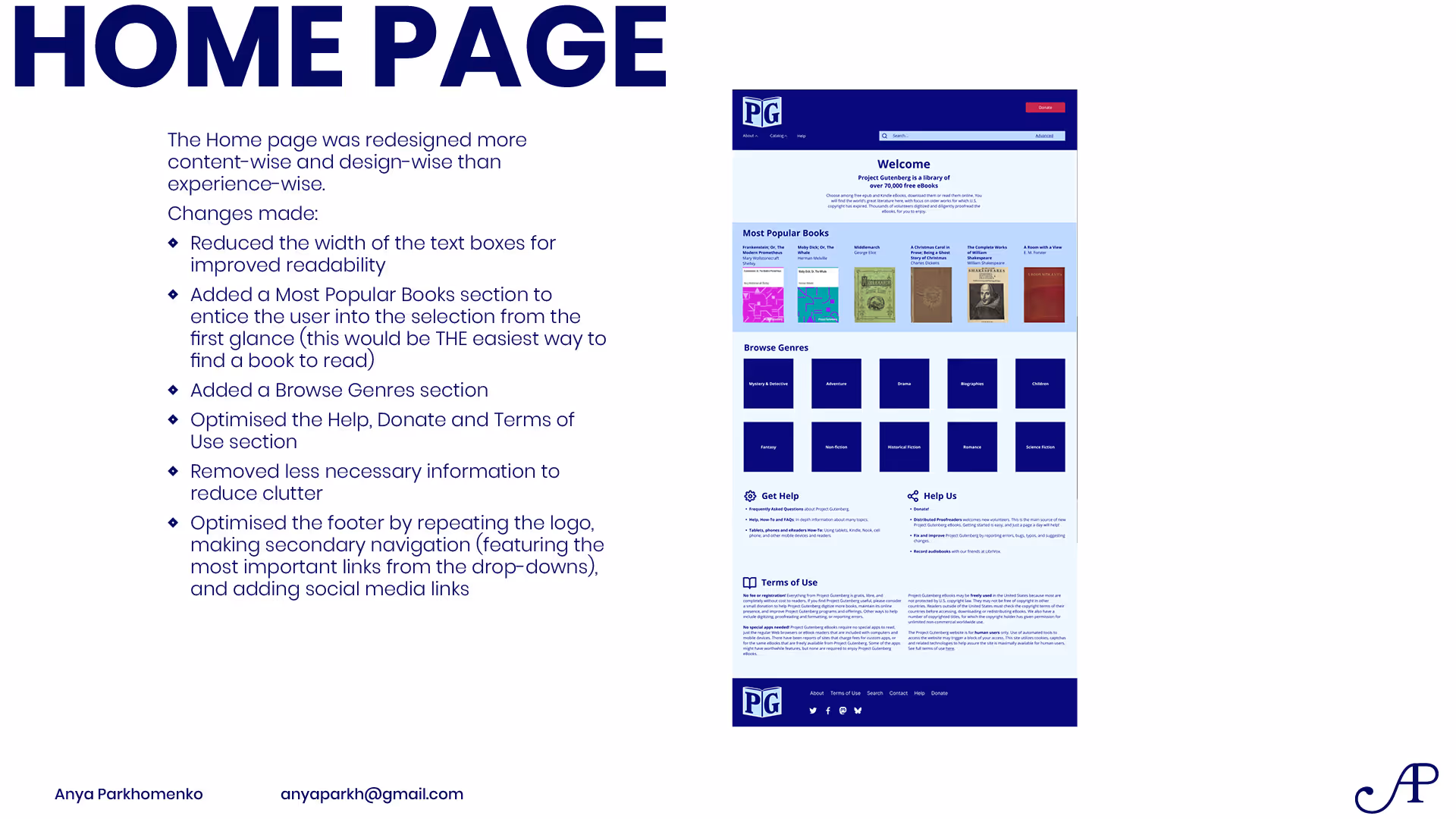
- Discover & Featured sections
- Recommendations for the next book based on the current
- Reviewing and rating books (may be simplified)
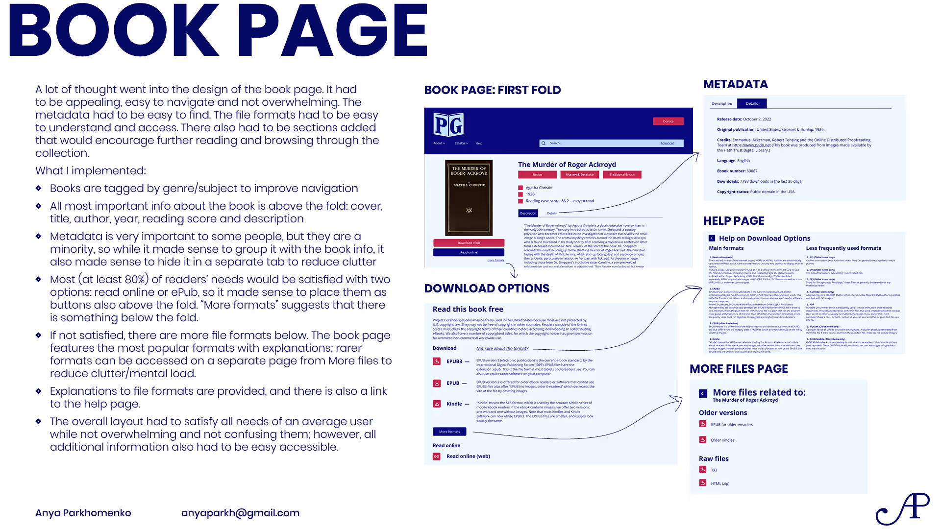
- Clear separate metadata section
- Keeping the layout clean and easy to navigate
- Many file formats and clear explanation of which to download and use
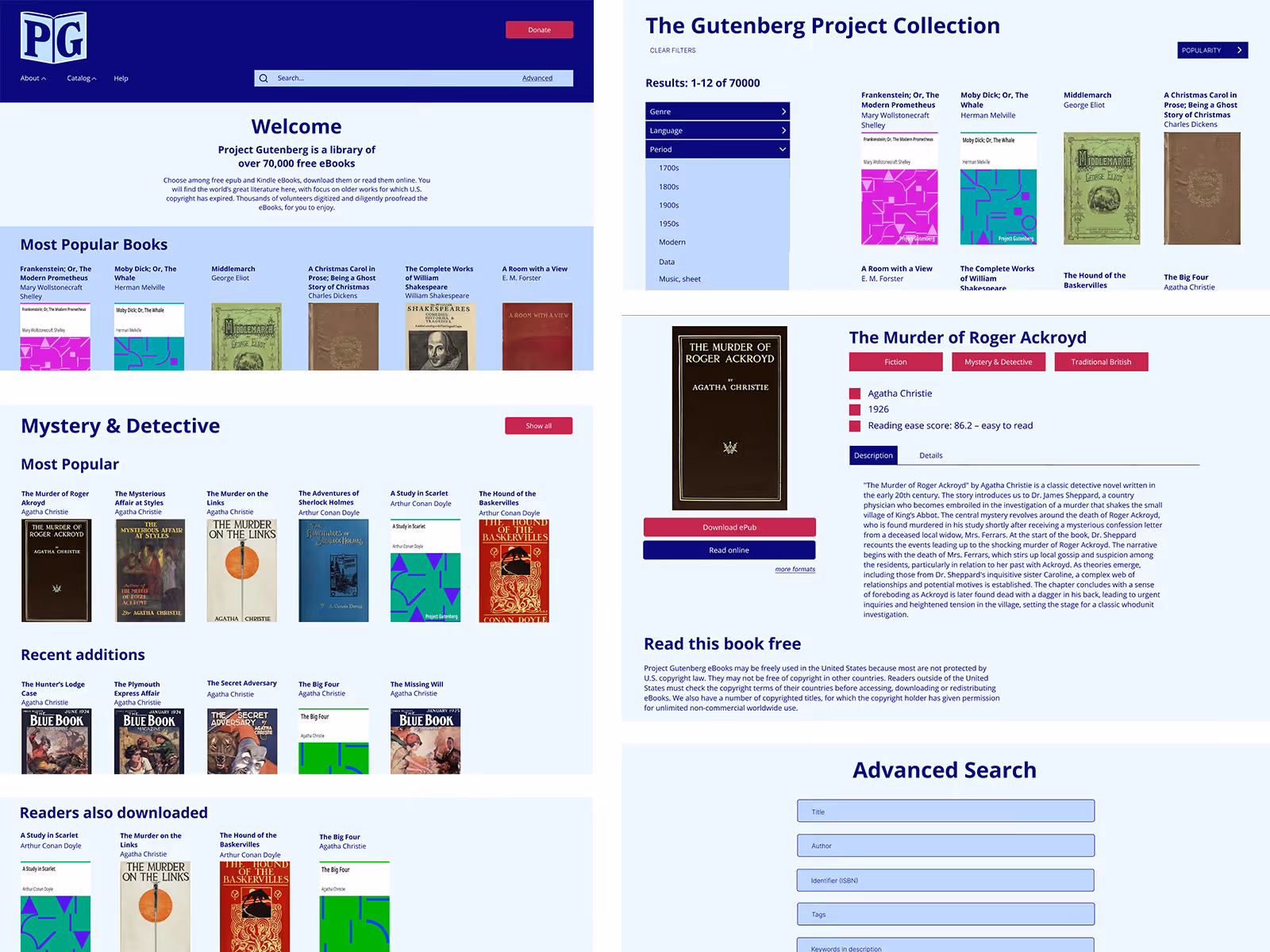
- Making the book page engaging, providing a summary for the book and focusing on promoting the book to the reader
Result
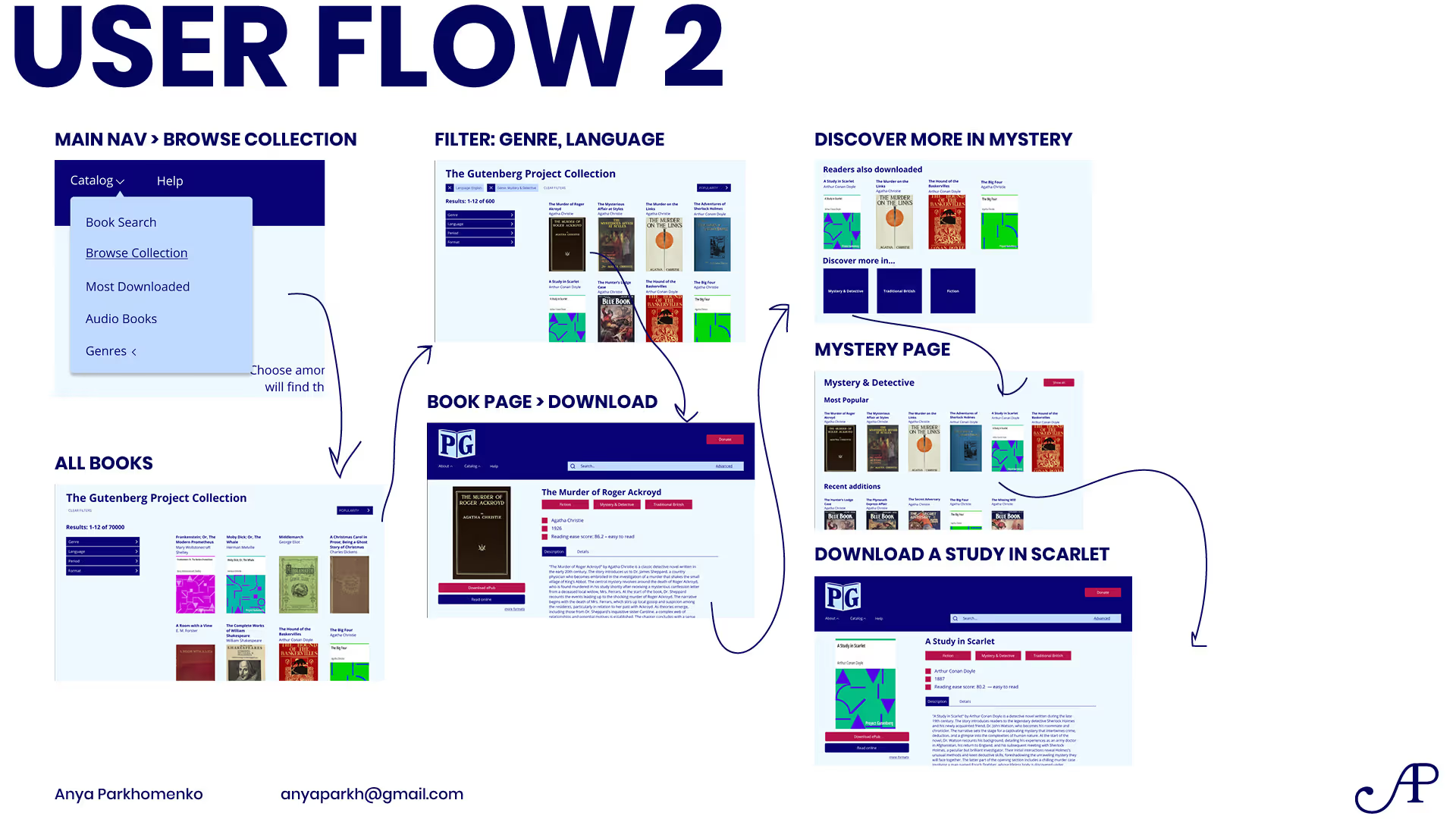
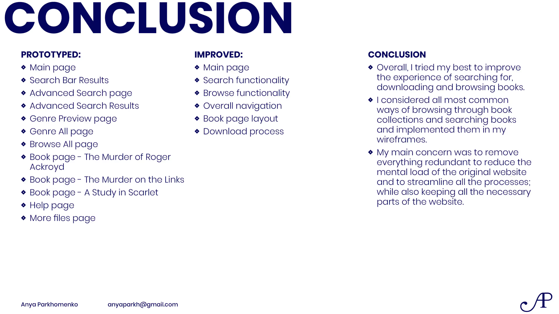
Streamlined the user flows from the Home page to finding a particular book to finding a similar book through both the search and browsing paths.
Full prototype can be accessed here.