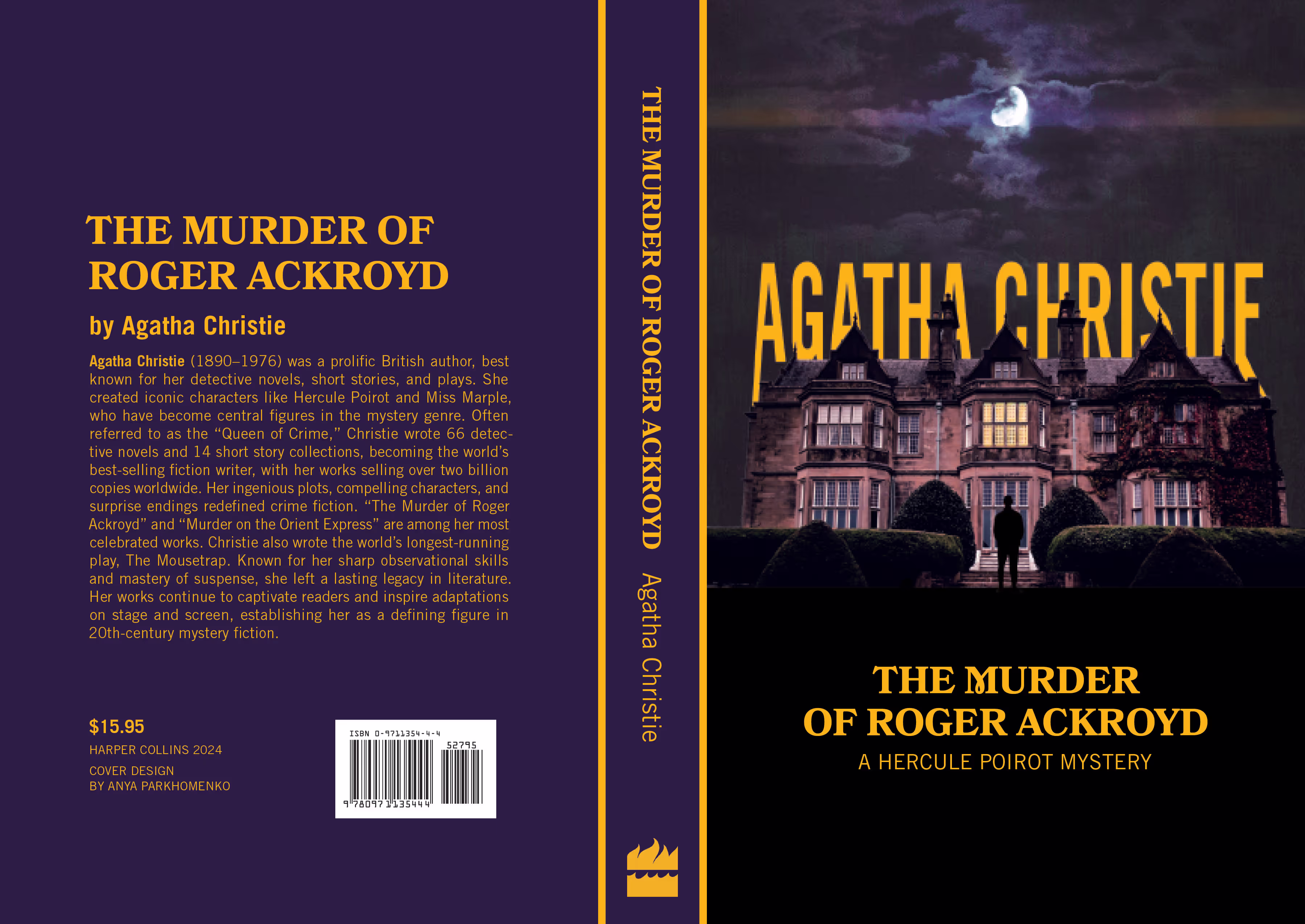
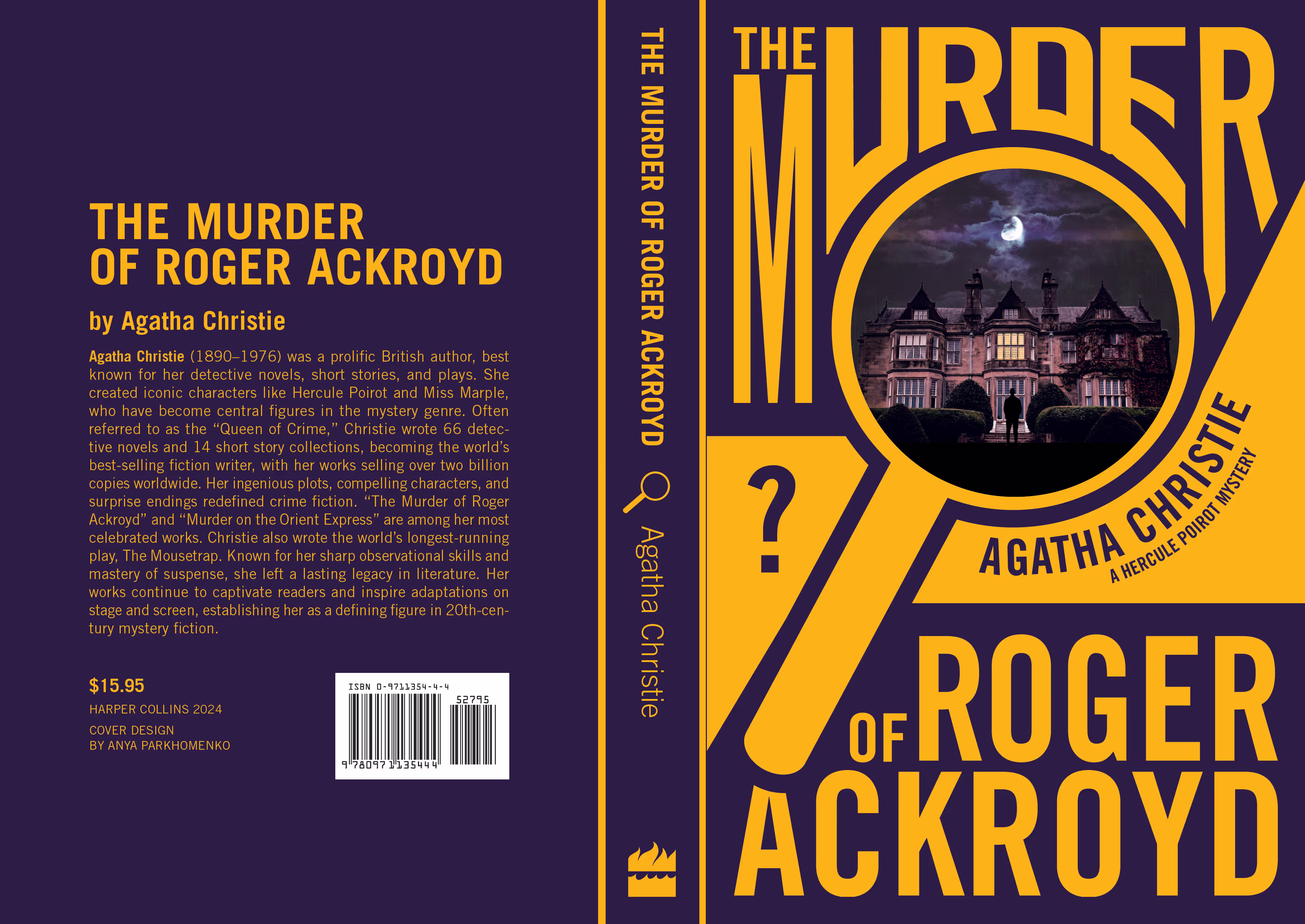
The Murder of Roger Ackroyd
Overview
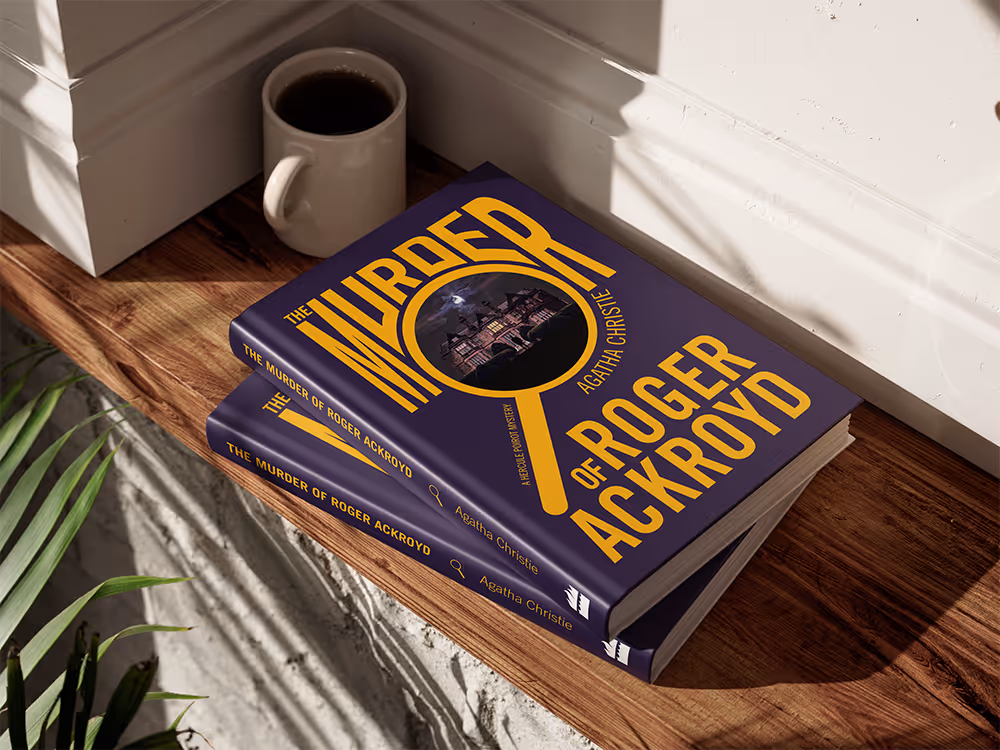
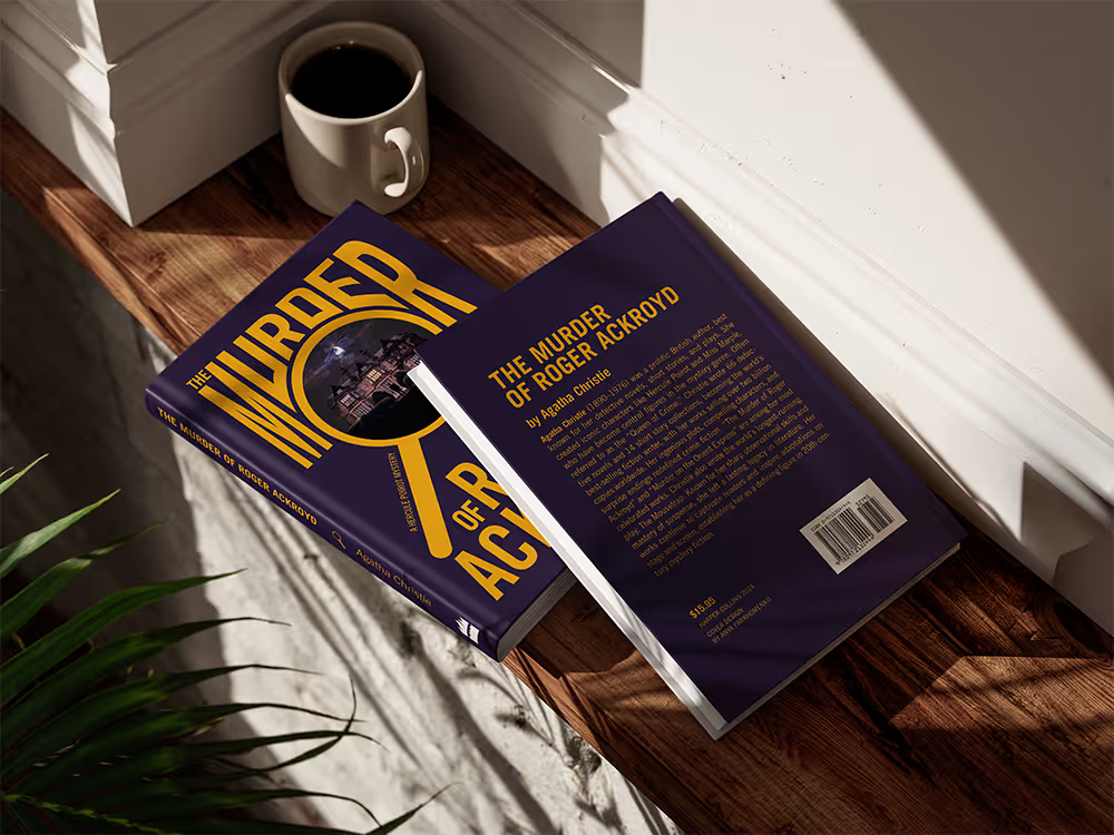
Goal
Create a book cover that would capture the essense of the story and promote it to a wider audience.
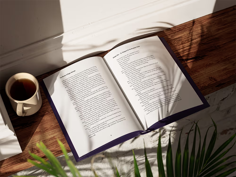
Create a 32-page book specimen that is properly formatted, easy to read and is consistent with the cover.
Challenge
Reimagining the appearance of a hundred-year-old classic novel to make it appeal to current readers and stand out on a bookshelf.
Strategy
Bold, untraditional layout to grab attention.
Centering an image composition within the circular frame to draw the eye towards the book cover.
Complimentary colors with a high contrast that also work for the mood of the book.
Sans-serif typeface to modernize the book and step away from the traditional classical book look.
Target Audience
Younger book lovers that enjoy suspense and detectives.
Fans of the new Agatha Christie movies with Kenneth Branagh.
Older audiences that grew up with the book and want to update their collections.
Process
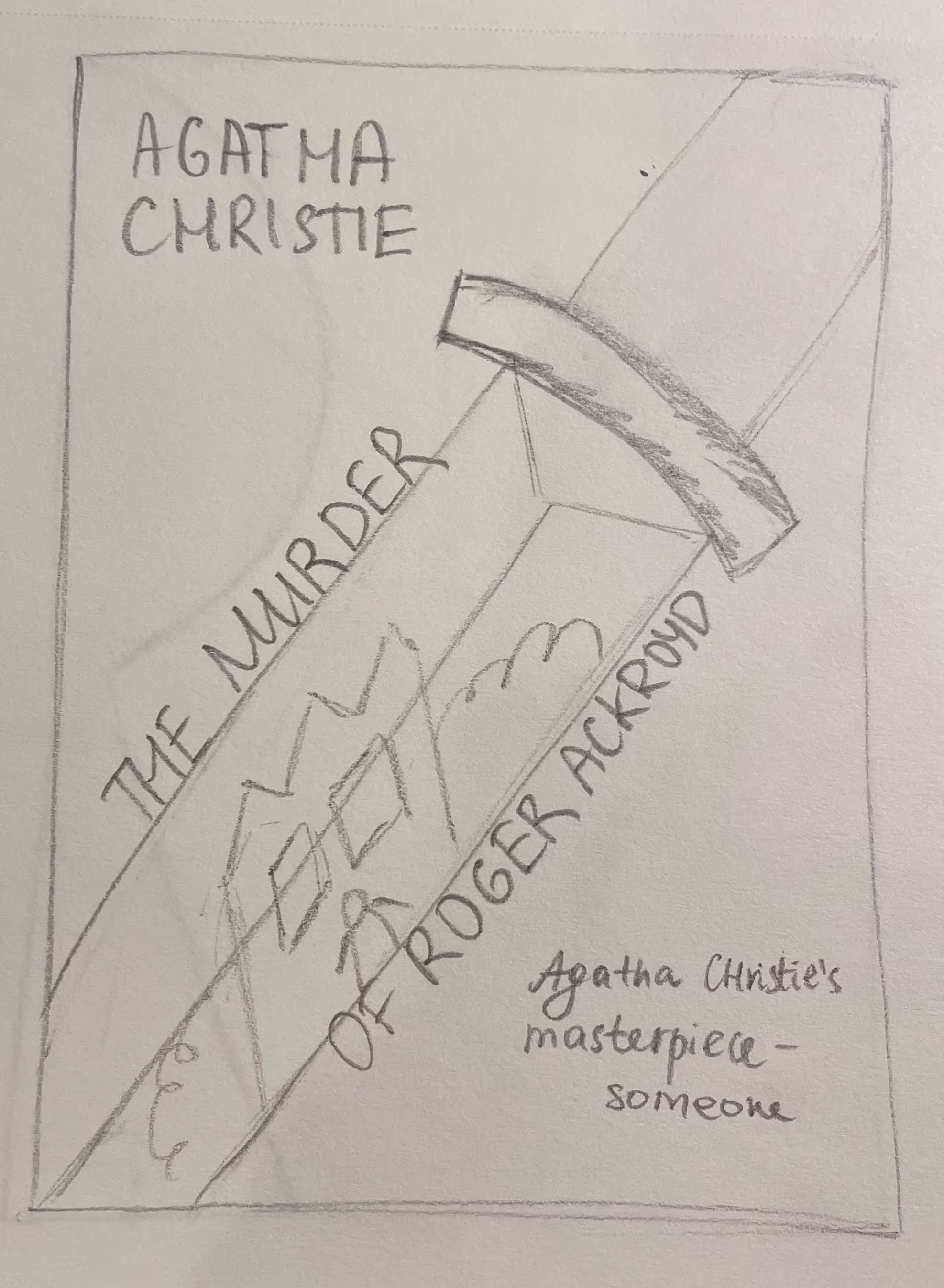
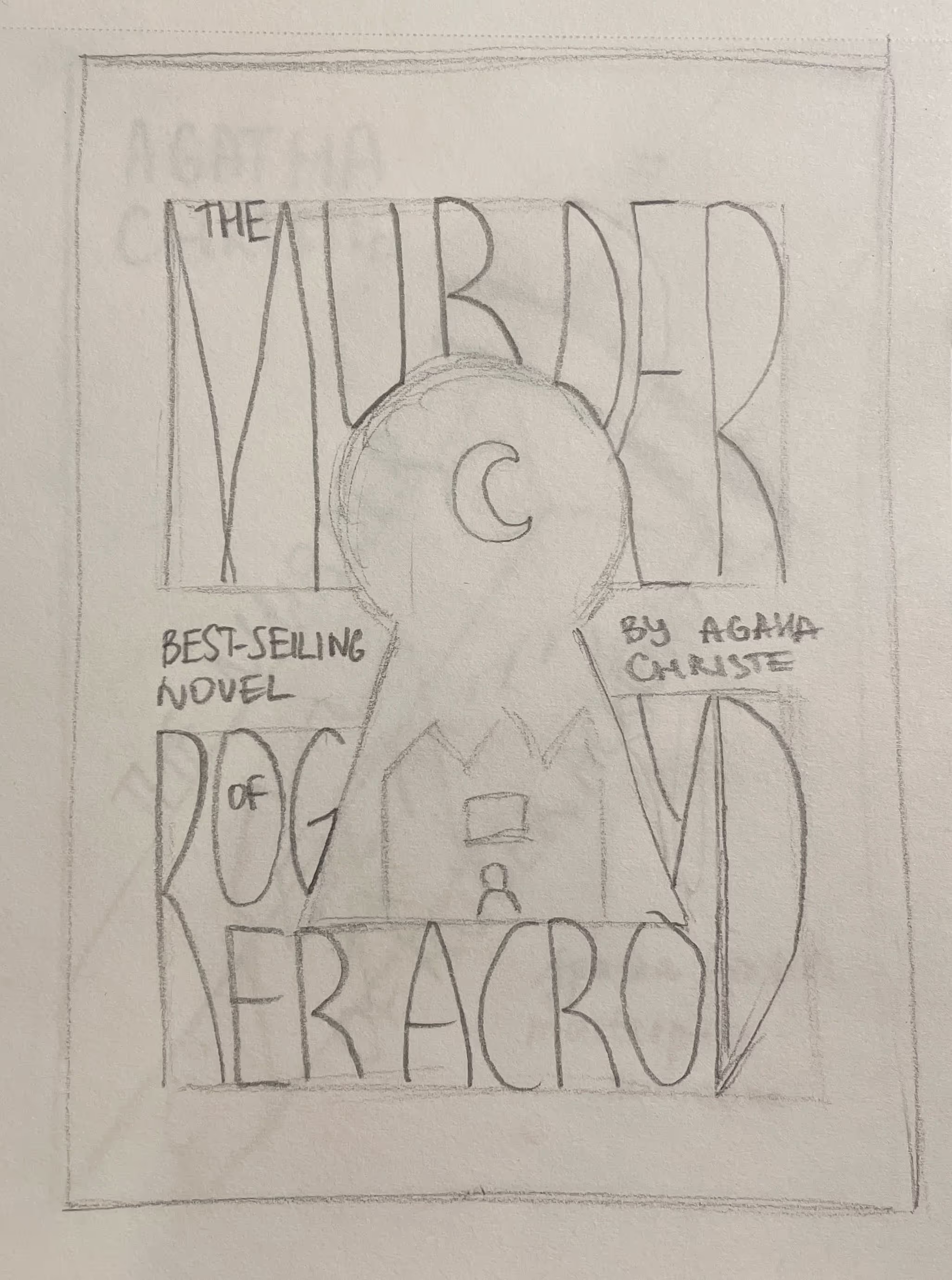
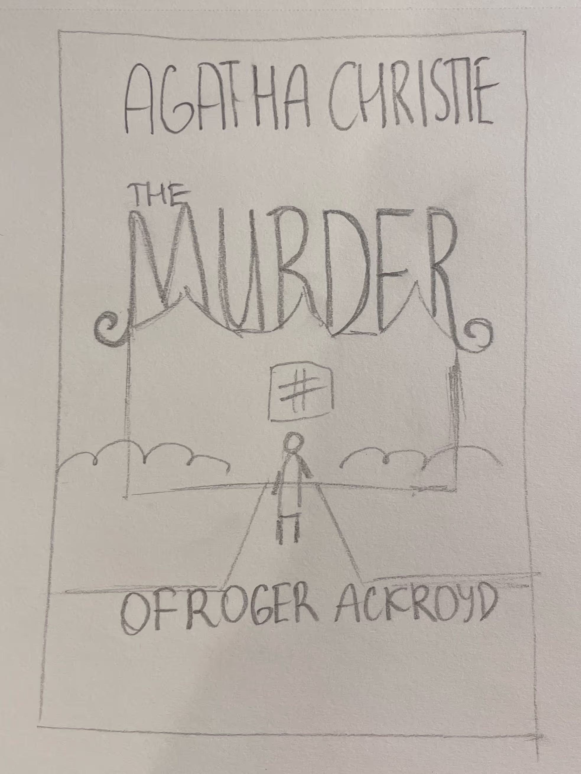
Sketches
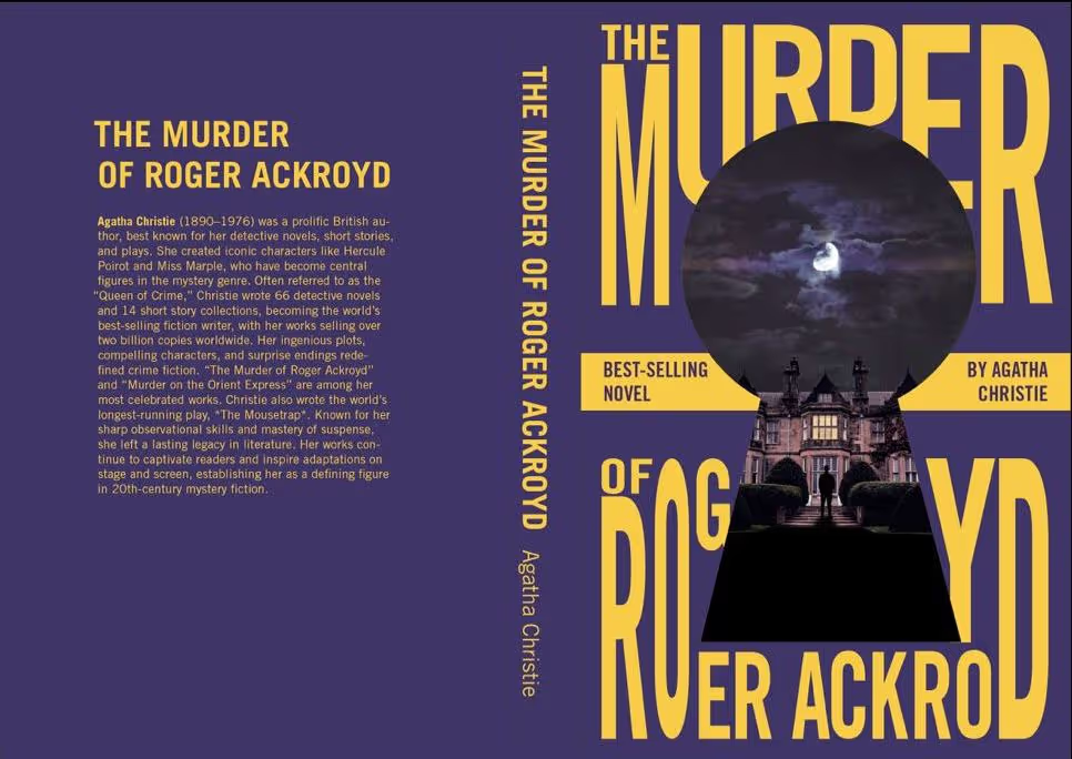
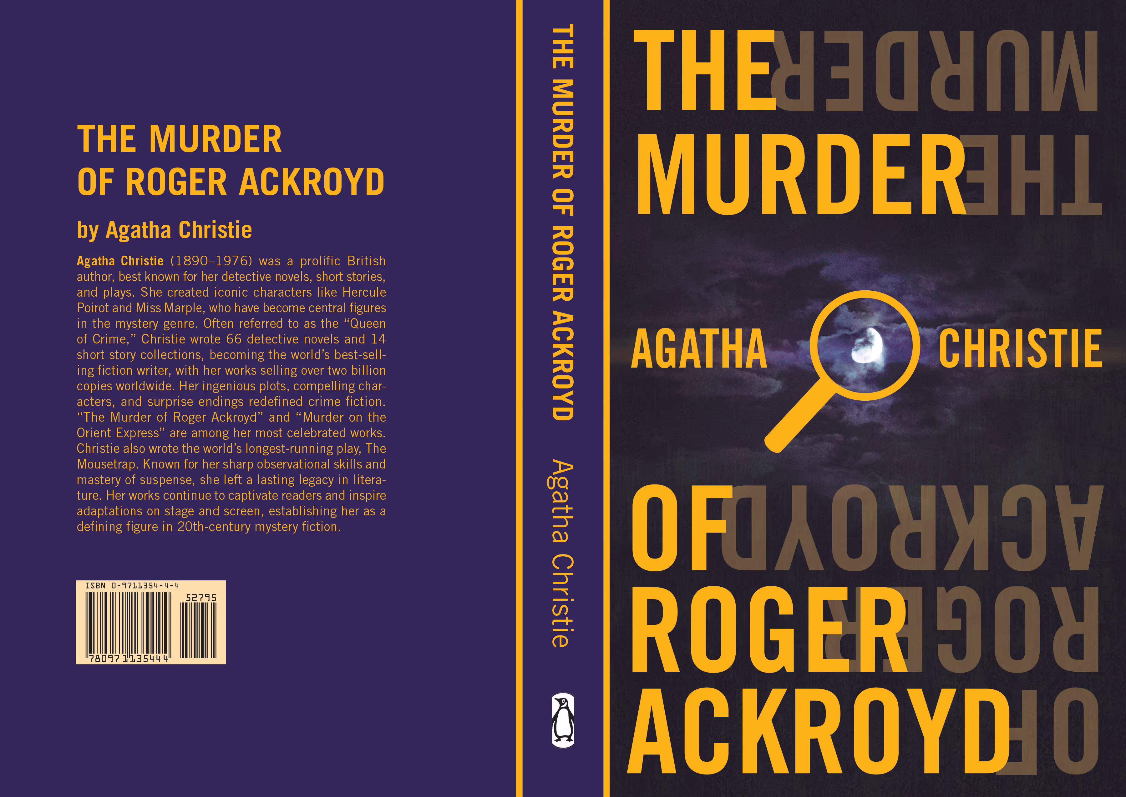
Digital Roughs


Book Specimen
Result
Created a book cover and book specimen that stands out clearly and boldly on a shelf, reimagining the classic look of the novel and modernizing it.